Getting your head around choosing and using type
Welcome to my rough guide to the terminology of type, of choosing typefaces, and the use and detailing of doing things with type.
This is a presentation I prepared for my Spatial Type class, which is a group of awesome students who include visual communication majors who are familiar with typography, but also spatial designers who might not be.
It might be dead boring for editorial design old hands, and it might be a bit much for those who don’t stray far from Myriad Pro or whatever the PC serves up as a default, but hopefully it’s a reminder for some, and a taster or prompt for others. It’s adapted from a print perspective, but these things generally hold true regardless of medium.
Typefaces vs. fonts
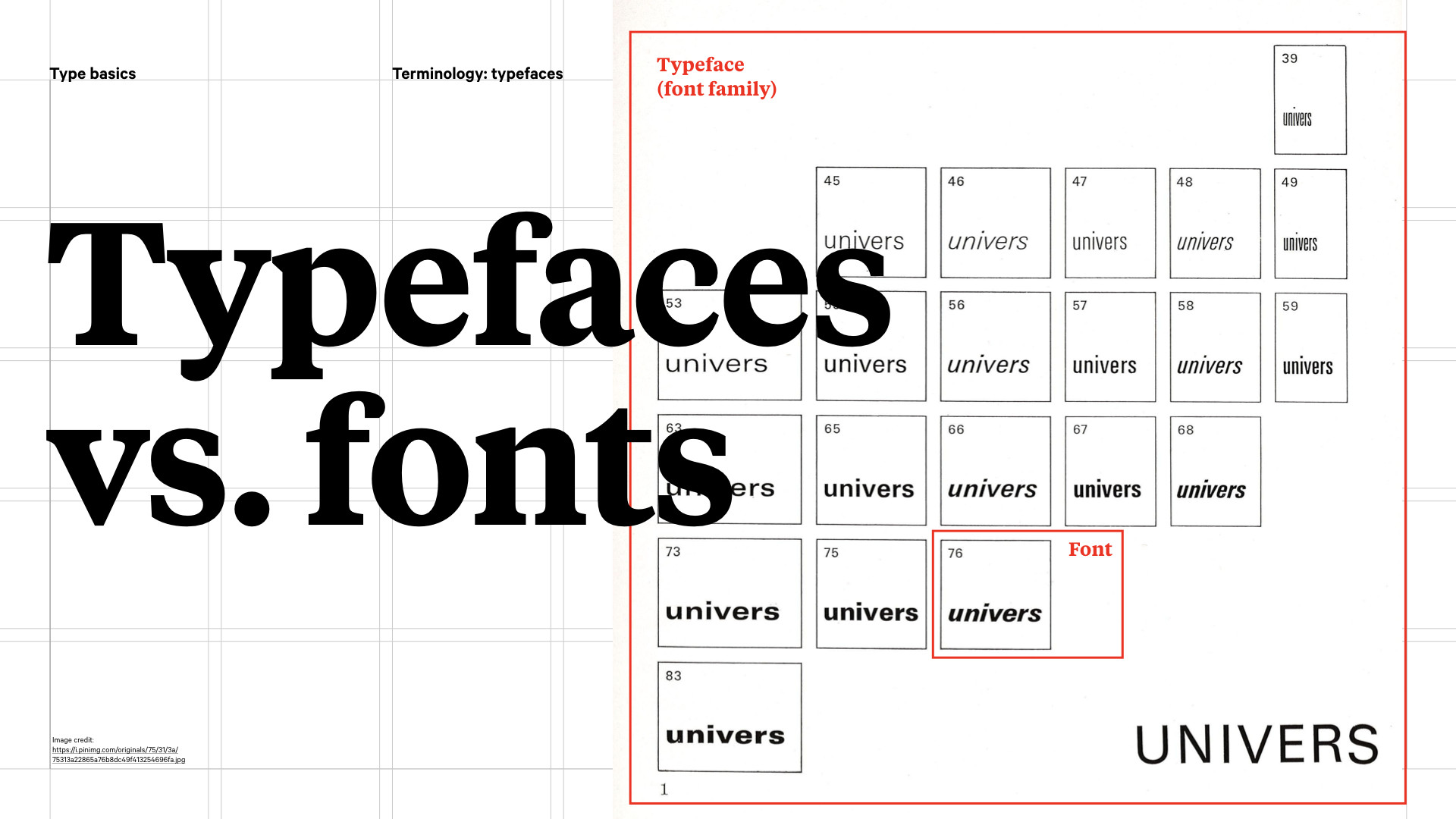
Let’s start with some disambiguation. Typeface and font get used as synonyms, and usually that’s ok, but there is a difference. A typeface is the collective name for a family of related fonts (so here, we have Adrian Frutiger’s famous Univers family designed in 1957),while fonts refer to the weights, widths, and styles that constitute a typeface. So each of Univers’ weight and width and style combinations is a font. It’s a bit pedantic, but you never know, it might come up in a pub quiz.
Classifications
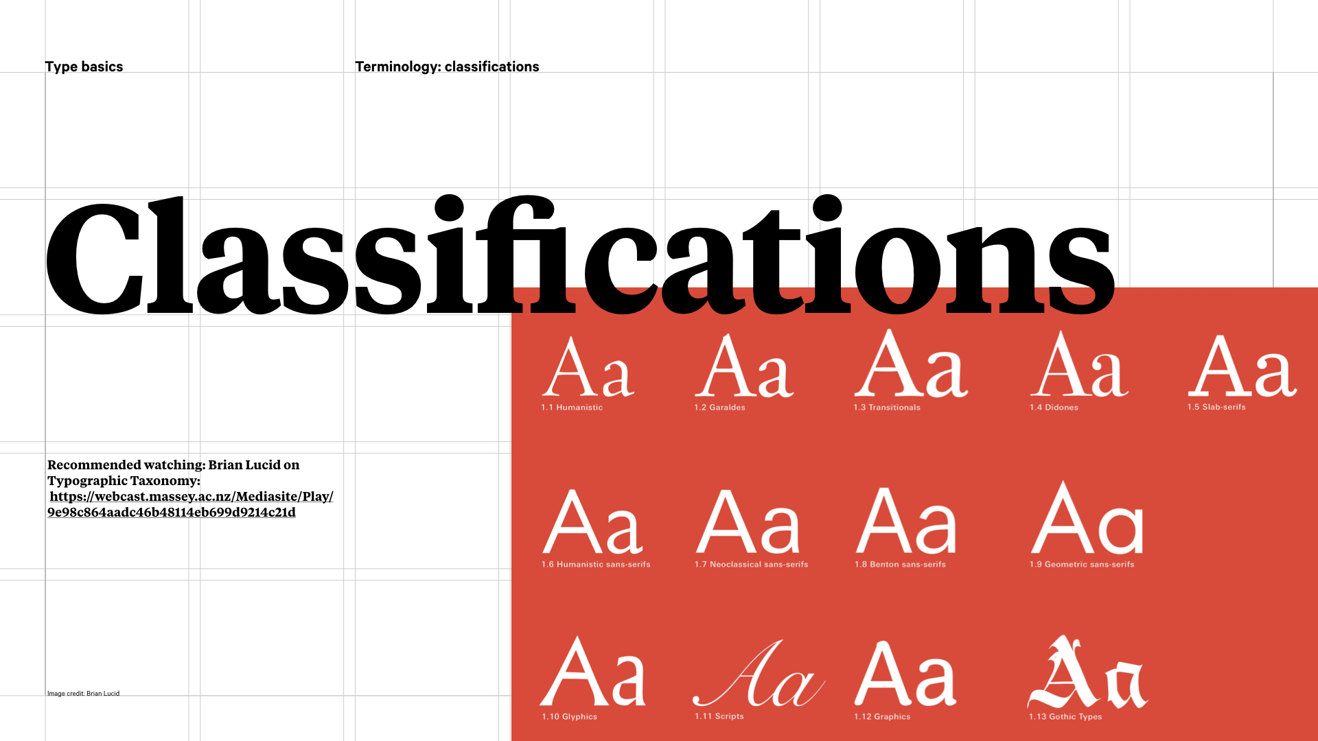
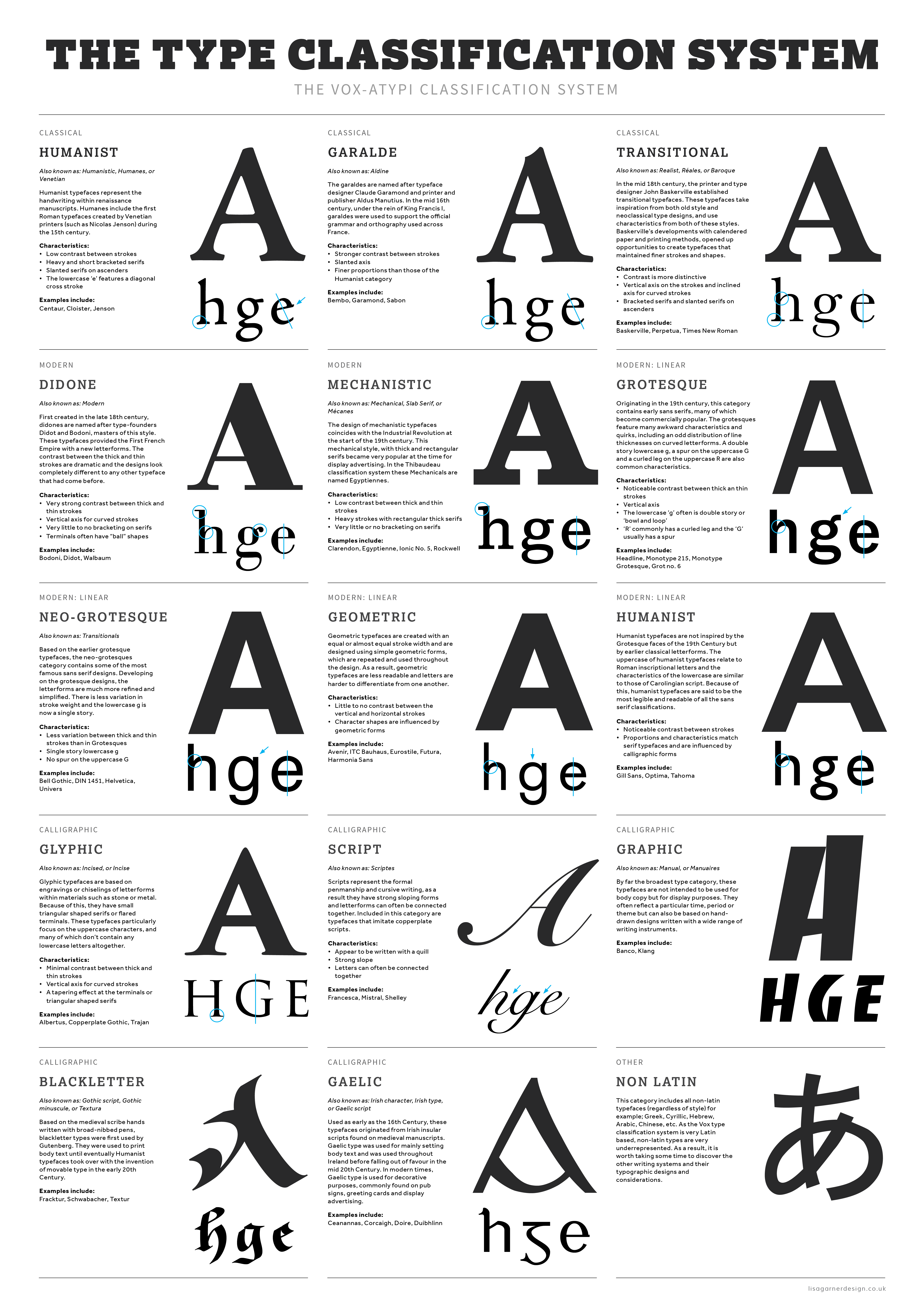
But let’s take a step back. There are various ways of classifying typefaces. Typeface classifications reflect history and the technology that made type at that time possible, from the pen, metal type, paper quality, etcetera. Nowadays, mostly we render type via a computer, but people still refer back to the classifications because they tell us something about the characteristics, so are a kind of expert shorthand. Above is the Vox classification system, and it’s probably more exhaustive than you need to know on a day to day basis, but here’s what you do need to know…
Serif and sans serifs
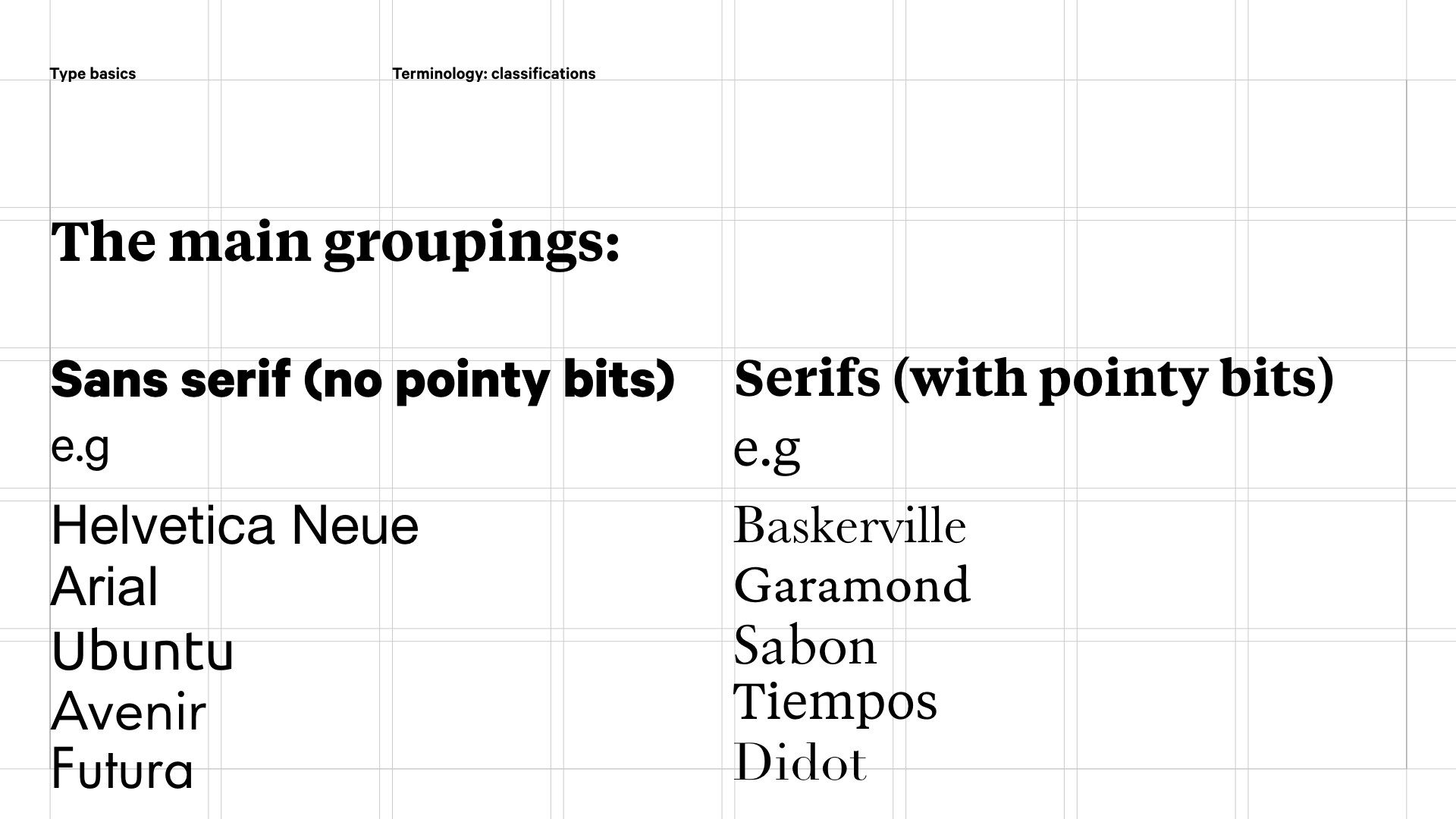
At the top level, there are serif and sans serif typefaces. Serifs are the pointy bits, so serif typefaces have the little pointy feet. Sans just means without, so without serifs.
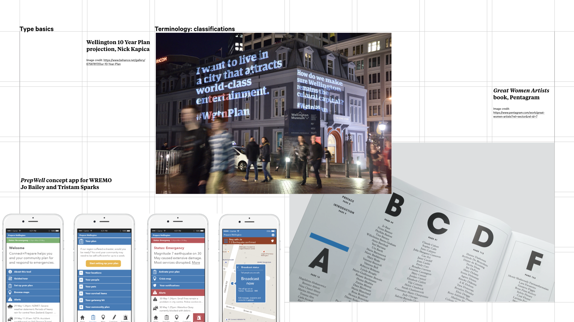
Examples of serifs and sans serifs in use: Wellington 10 Year Plan projection, Nick Kapica; Great Women Artists book, Pentagram; PrepWell concept app for WREMO, Jo Bailey and Tristam Sparks
These are the kind of typefaces you can read, so are your go to for book text, sign text, web text… any time quick transformation of information into cognition is required. And then there’s everything else:
Other classifications
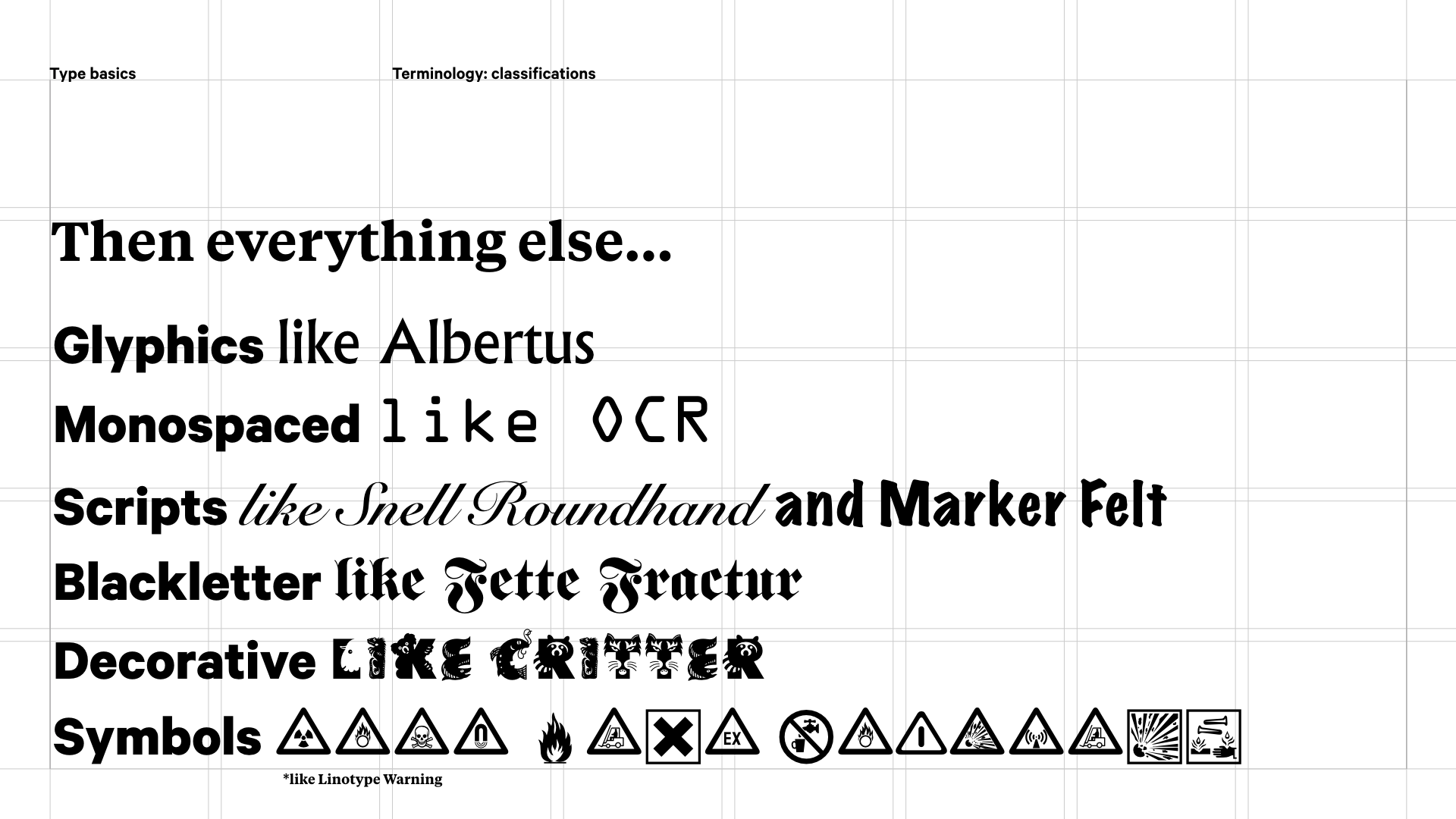
These are typefaces that are used for display or decorative purposes. You might use them for headlines or titles, or for expressive elements, or as part of themed project:
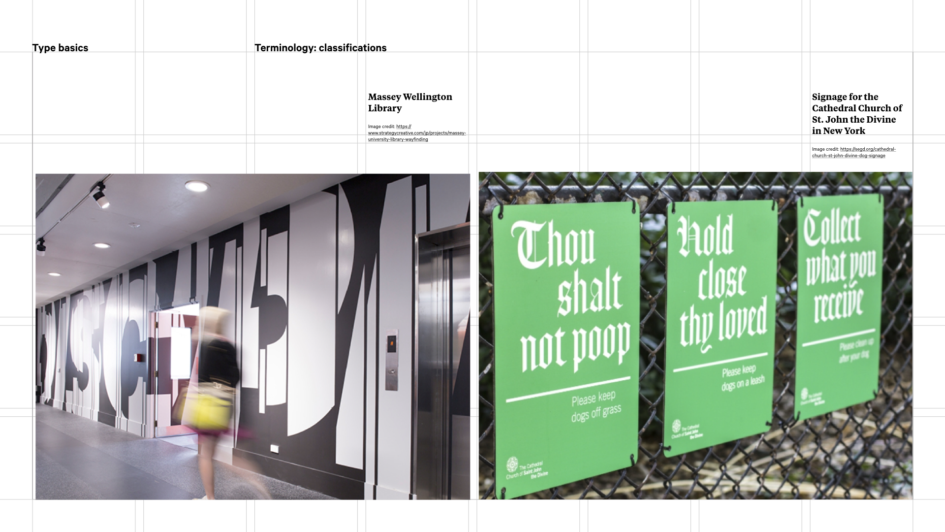
Massey Library expressive type, Strategy/Nick Kapica; signage for the Cathedral Church of St. John the Divine in New York, Pentagram
So for instance, the type in our library stairwells at Massey Wellington is deliberately ambiguous because it’s supposed to suggest dynamism rather than be read. Or this sign system by Pentagram uses blackletter for headlines, because its a bit of a themed joke. It’s in the grounds of a cathedral – blackletter says historical and formal and the sign is set as a commandment. You can see it is augmented with a clean sans serif. You couldn’t swap these round though and have the blackletter for the smaller detail text because it would be too hard to read.
Describing fonts
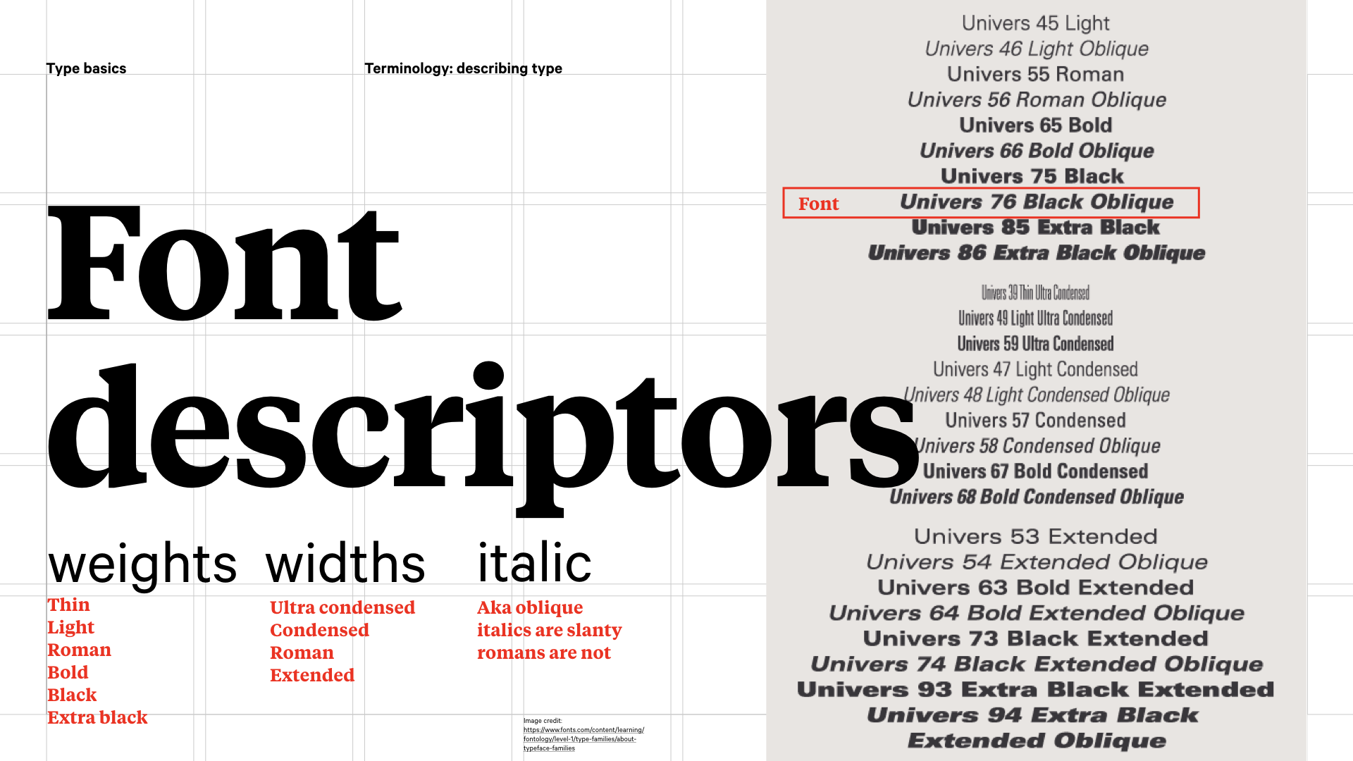
There are a few ways we talk about type to describe some of its attributes. When printing type was first invented, the notion of having a family of type hadn’t occurred to anyone. All fonts were simply roman (regular) designs. In the early 16th century italic type became increasingly widespread, and by the late 1700s, foundries began to release fonts in families – pairing roman and italic designs that matched each other in style. Later the concept of typeface weights and proportions was added to the typeface family mix. In the 20th century, type families were enlarged even further with the introduction of different designs such as condensed, and expanded.
In 1957, when our Swiss friend Adrian Frutiger designed Univers, he proposed a logical, systematic numbering scheme covering weights, italics or romans, and compressed to extended.Some other families like Neue Helvetica and Serifa use this numbering system, but it’s not a standard. Many others have different terms in the mix like ultrafine, fine, medium, semibold, heavy… Look at what your family has to offer – you might have more than regular and bold at your disposal!
You’ll also have some other ways of talking about type with which you’re no doubt familiar. The specification of size –which will vary from print (points) to screen (ems, pixels) (and it’s worth noting that point sizes will vary across fonts, so a 12pt for instance isn’t a universal size) – and also the case:
UPPER CASE (all caps)
lower case (all small letters)
Sentence case (first word capitalised)
Title Case (everything but joining words capitalised)
There are many resources that cover these, and hopefully you remember most of them from English class!
The anatomy of type
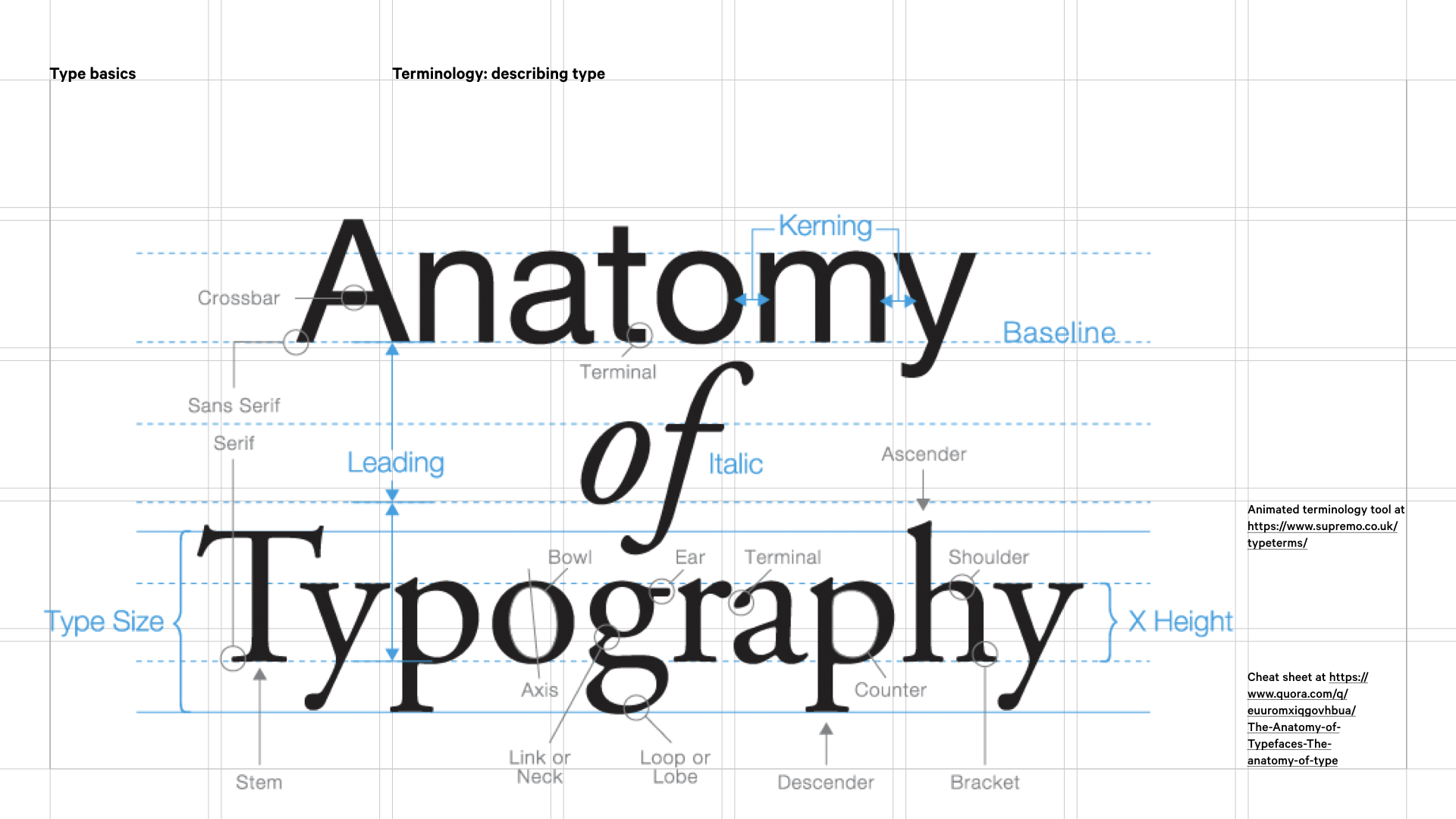
The terminology of how we talk about letterforms is a presentation in its own right, so this is a mere nod to an area of expertise you might want to delve into. Now there are a whole heap of these, and plenty of resources to use to get familiar, a couple of which I have linked to here. There are some key ones it is worth getting your head around:
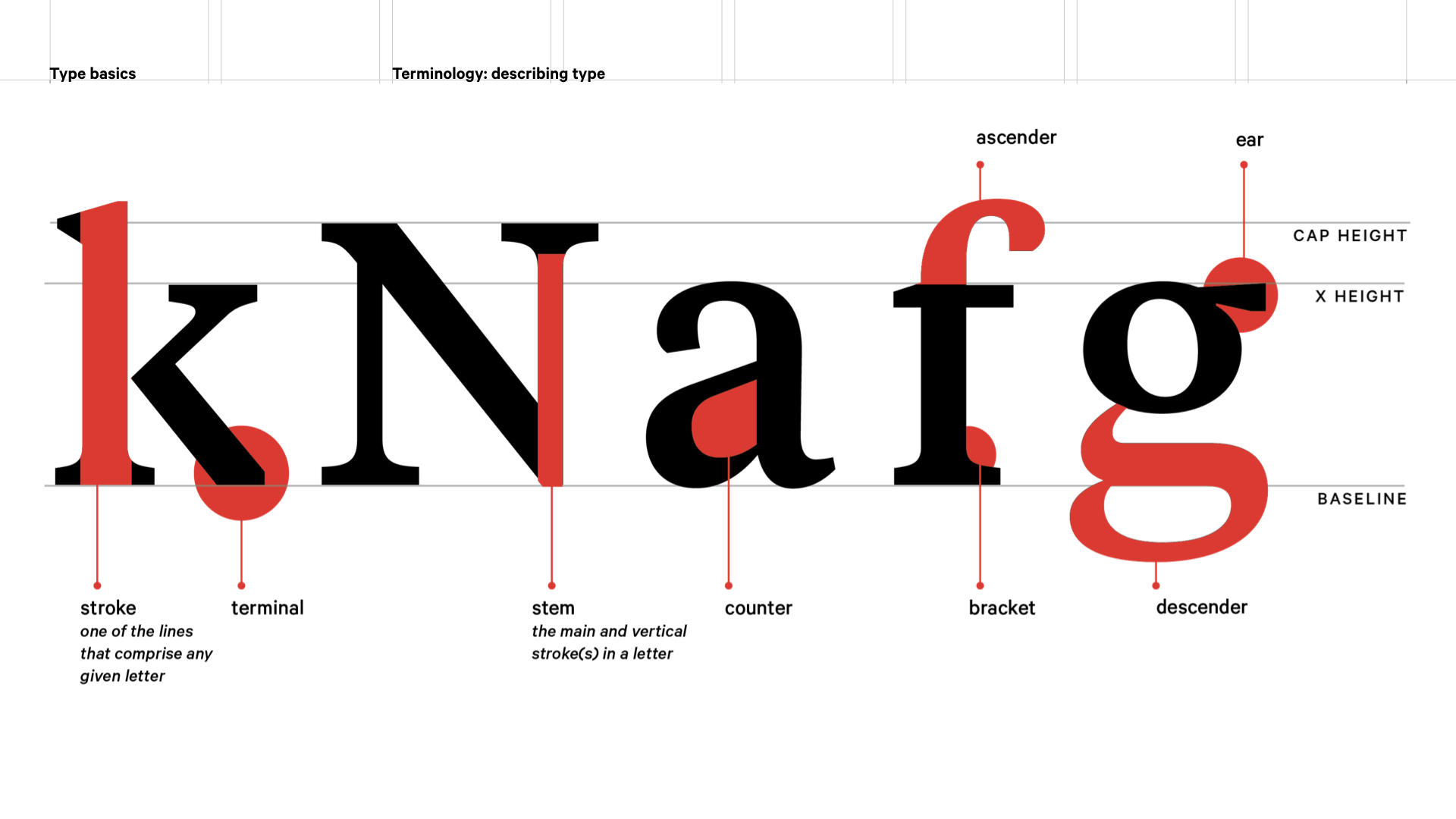
I’d suggest learning the lines: baseline, x height and cap height, which are fairly self explanatory, but note that rounded characters will dip slightly below the baseline so they look optically like they sit on it.
Other key ones are stroke, which is simply one of the lines that comprise any given letter. A stroke can be straight or curved, and open or closed. For example, in the lowercase k, there are three strokes, both vertical and diagonal.
A subset of stroke is the stem, which is the main vertical stroke or strokes in a letter, highlighted in the N above.
Serifs, as we know, are the little feet connected to the ends of strokes in letters or symbols, and these can have a curved or wedge-like connection between the stem and serif called a bracket. Where a stroke which doesn’t terminate in a serif, there is a terminal, shown on the K.
Counters are the insides of closed strokes, as in the lower case A above. I’ve included ear on the lower case g, as it is my personal favourite!
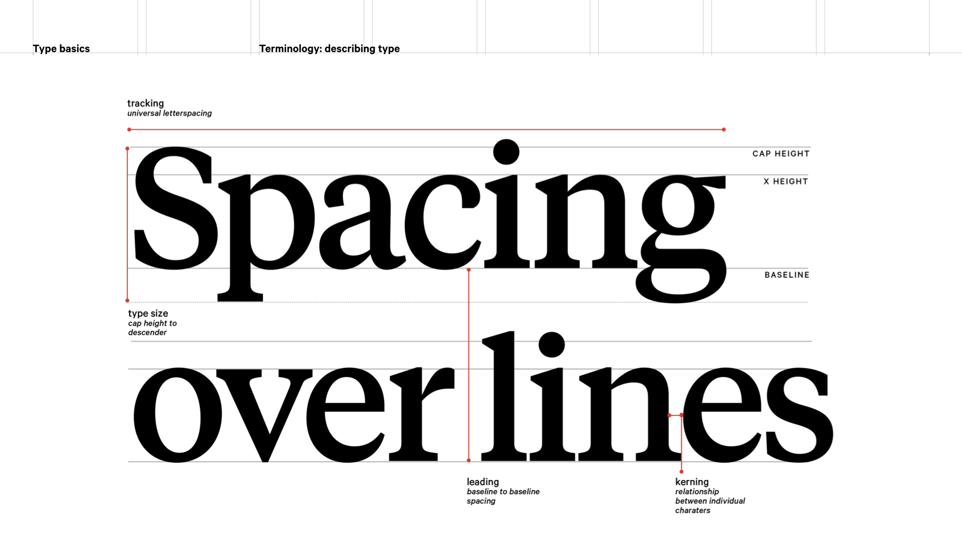
There are some other spatial terms worth knowing that we will touch on a little later in terms of how these should be managed. Obviously we have text size, but the spacing between lines of text is also carefully controlled, and that’s called the leading. If we manage the spacing between all letters in a block of text, that’s called tracking. If you need to manage the spacing between individual letters, that’s called kerning. Tracking and kerning are things you’ll usually only need to do to feature or heading text that’s at scale.
What's your type? Choosing typefaces
So how do you choose typefaces? How do you know what will work?
One of the things I find helpful to nail down near the start of a project is what you want your design output to feel like – the personality you want it to have. This will have a lot to do with the audience and the purpose of the artefact you are producing.
Typefaces are the clothes that words wear, and like clothes, they can express different qualities. Think about your project’s output and the typefaces you will use in terms of certain characteristics like if it’s human or mechanical; hard or soft. Also bear in mind if it has a specific emotional tone, or connotations relating to history. Is it possible to personify your project (‘this is totally Don Draper in Mad Men…’) and choose a typeface that feels the same, or appropriate?
I would suggest trying this: you’ve got your brief, you’ve though about where your project might be, so you should be able to articulate:
- The subject matter
- The medium
- What are the colours (literal or emotional)?
- Who is the audience?
- What will appeal to them?
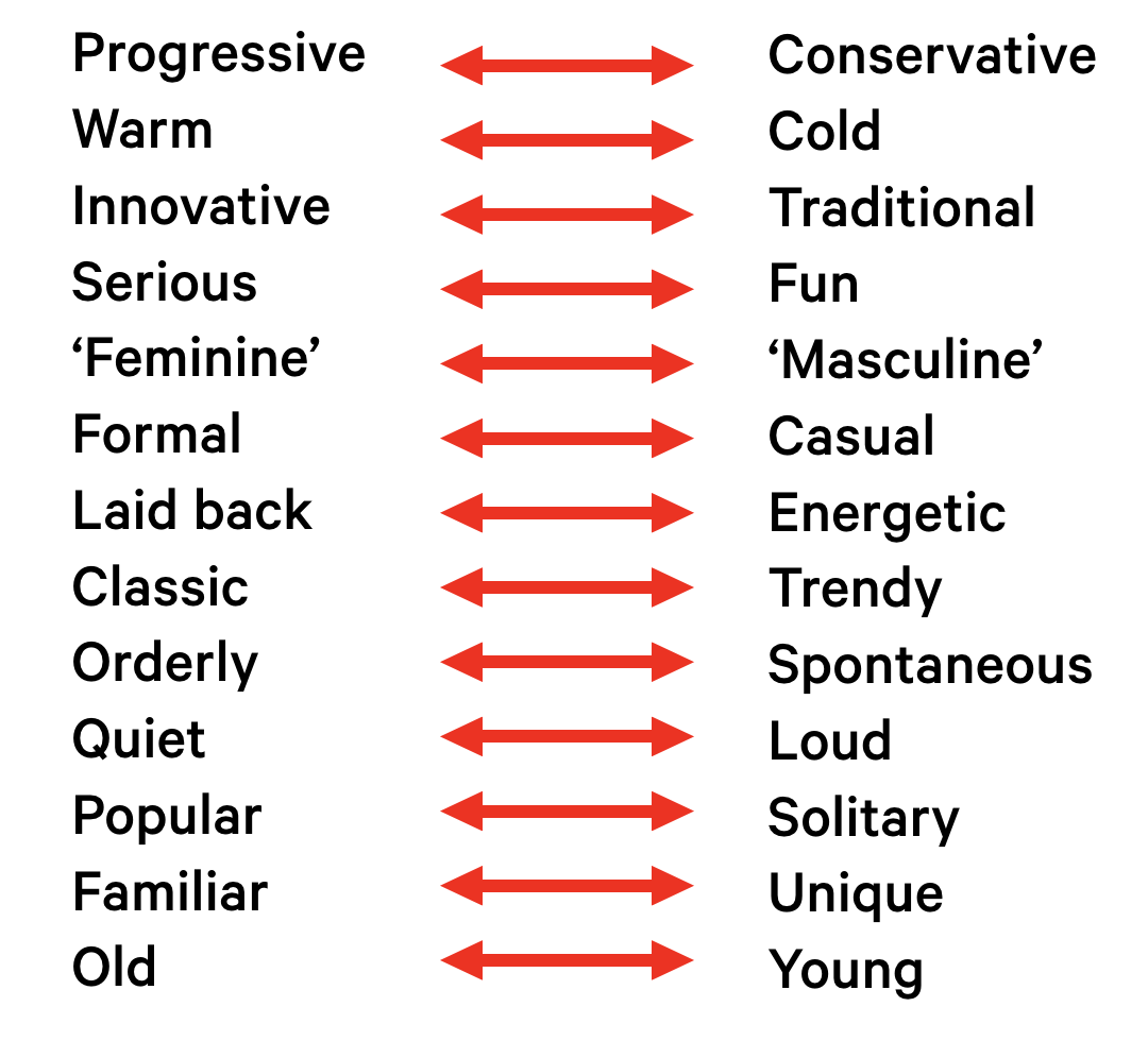
In essence you have thought about the experience you want the user to have. Then, list five words that describe the subject as you want to interpret it. Can you say it’s any of these things?
Make/Use is a Zero Waste fashion system. The typeface and materials (including an exhibition space) needed to embody a systematic feeling, it wanted to be designerly, to feel dynamic (in the sense that it’s contemporary and non-traditional), it needed to feel approachable, and suggest modification. We designed the typeface to suggest these things (and supported it with a clean, legible open source (which was important tho the philosophy if the project) sans serif, Ubuntu). From a material point of view, the publication was formed of four sheets that could be repurposed into a garment pattern, and could also be assembled into a broadsheet newspaper. Hence, the typeface choices embodied the qualities we wanted the project to have:
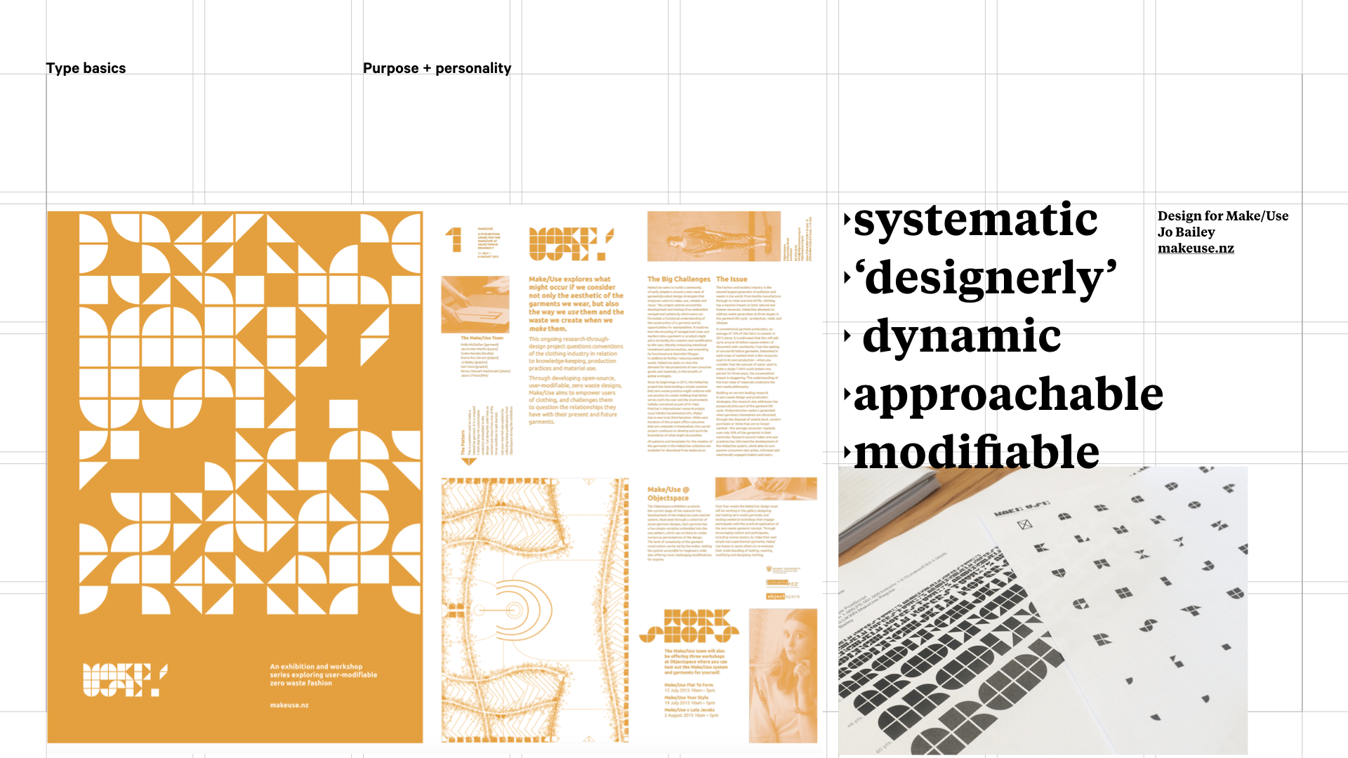
Make/Use, a disciplinary zero waste fashion project based on the work of Holly McQuillan
Typeface personalities
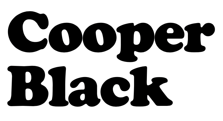
Some typefaces have very obvious personalities. Take Cooper Black for example. A straw poll in class generated words like playful, friendly, bouncy:
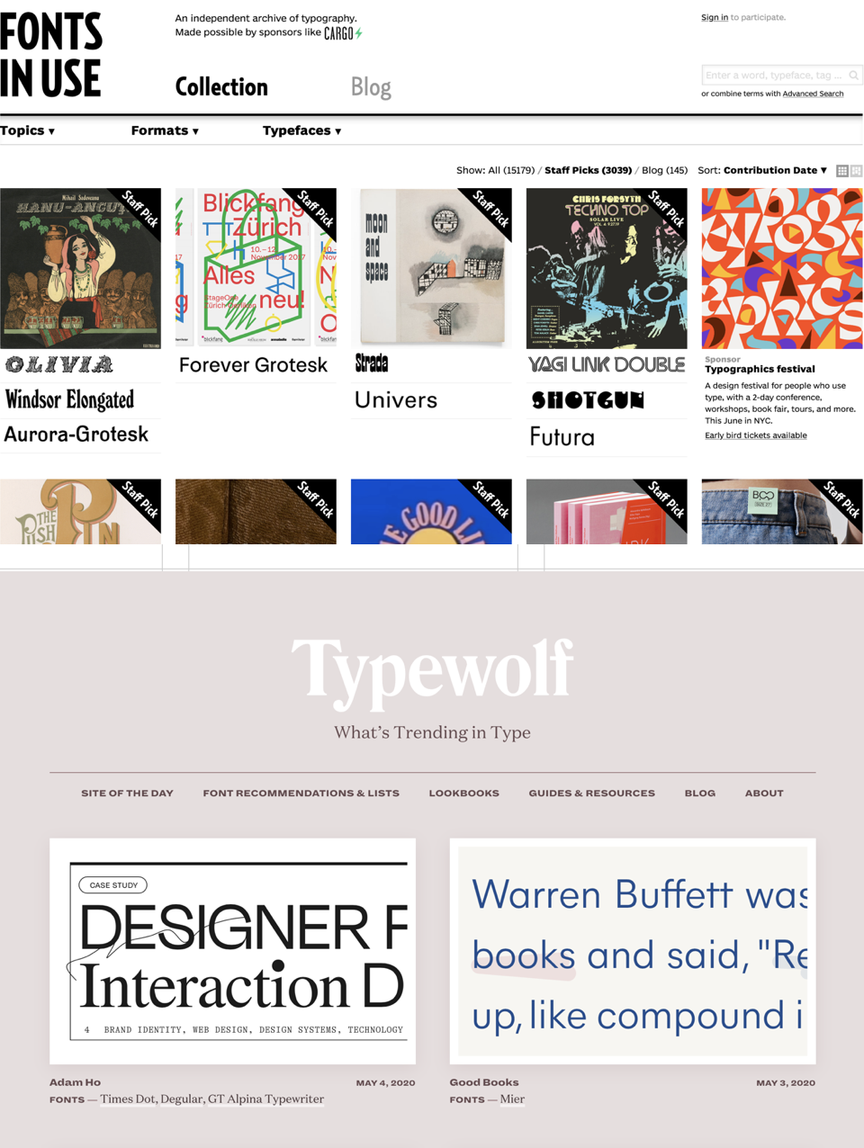
If you check out Cooper Black on Fonts in Use one example you’ll find is the Garfield books:
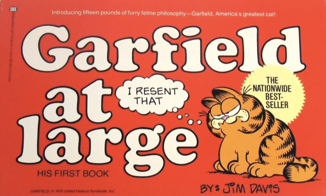
Garfield at Large cover, Fonts in Use
Like Garfield, Cooper Black is informal, chunky and round, comedic, and laid back. So here, typeface personality closely matches the subject.
But, despite its emergence in the 1920s, Cooper Black had a big moment in the 60s and 70s, so it has a kind of retro vibe too, which this other design on Fonts in Use picks up on:
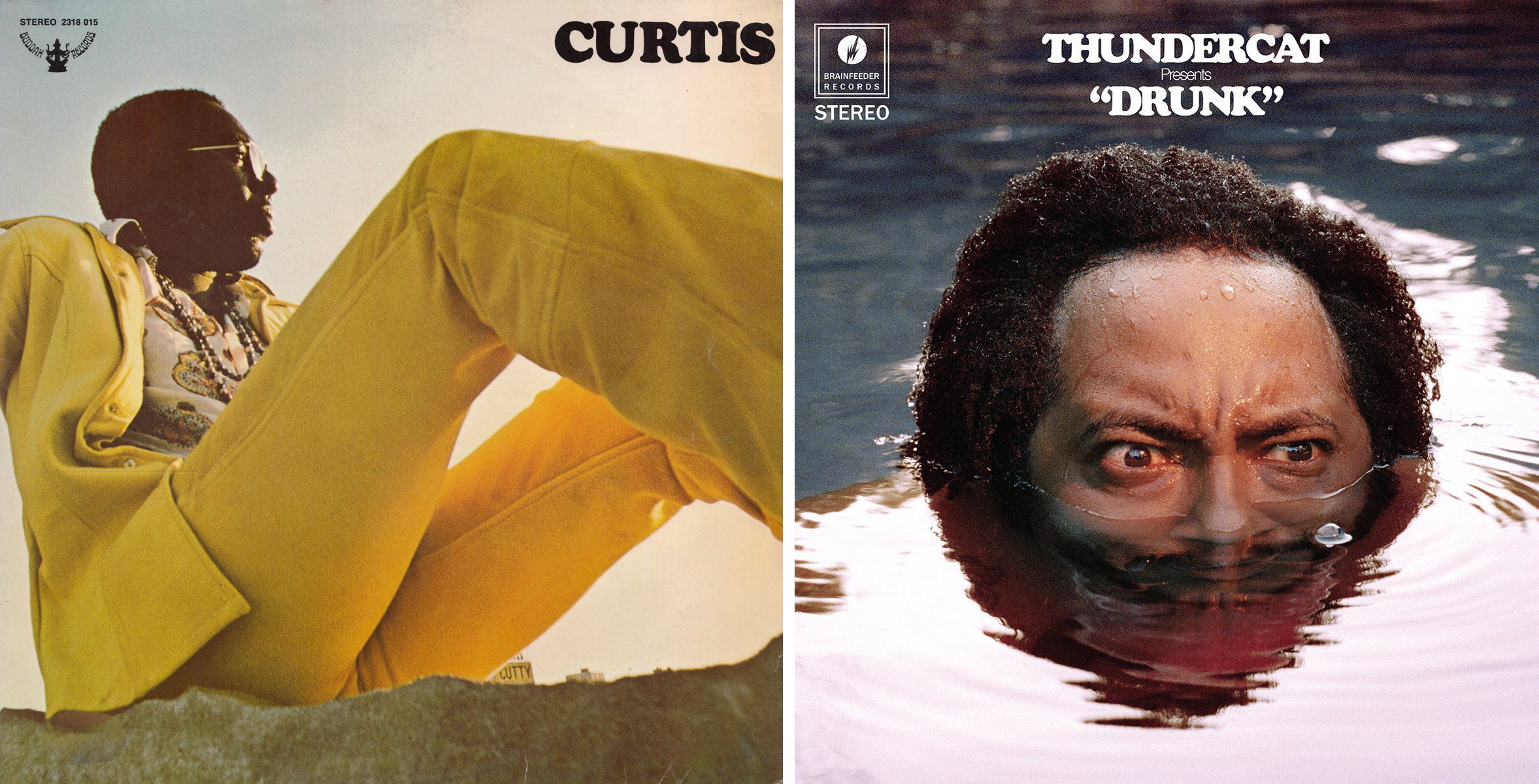
On the left, an album from 1970 and on the right, an album from 2017 clearly riffing off the vintage connotations. Cooper Black just takes you straight back to an era.
So the ‘personality’ of typefaces isn’t an exact science, and is very much informed by where we have seen fonts used before, so it’s worth testing assumptions, and actually, typefaces like people can adapt to different environments too. Take a look at Gotham:
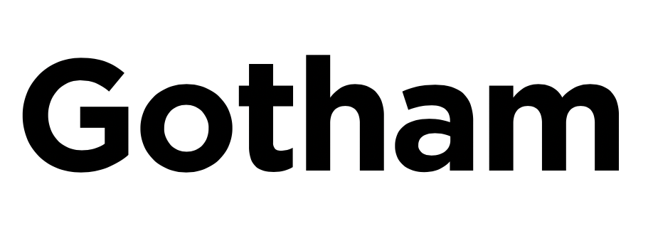
Gotham is a rounded geometric sans serif. Originally conceived for GQ magazine, who wanted a typeface with a "geometric structure" that would look "masculine, new, and fresh" for their magazine (source:Wikipedia). Designer Tobias Frere-Jones took inspiration from type on New York buildings, especially the sign on the Eighth Avenue façade of the Port Authority Bus Terminal. These kind of municipal buildings have a certain authority and credibility, and if we look at where Gotham has been used, we can perhaps see it is tapping into similar need:
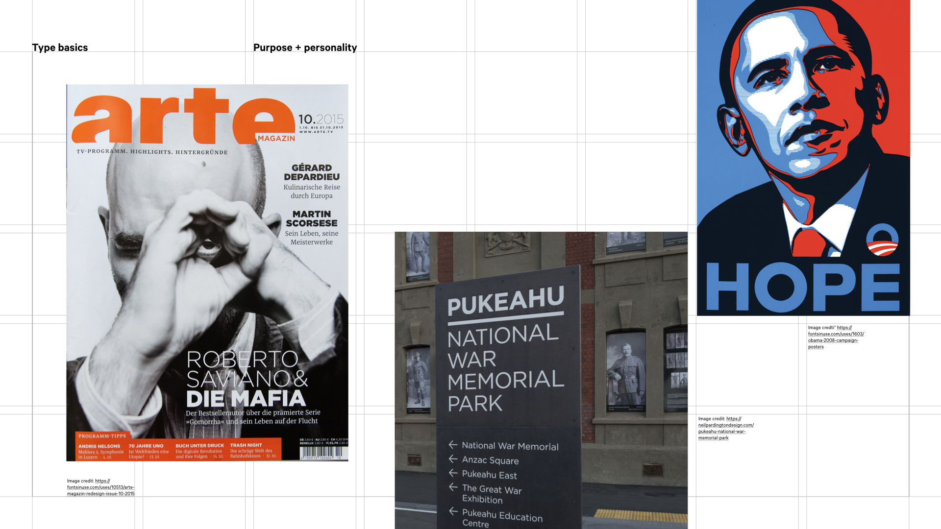
Arte Magazine cover; wayfinding and signage for Pukeahu Park, Wellington by Neil Pardington and Shepard Fairey's famous Obama poster
Above we can see Gotham working for a contemporary art magazine where it’s fresh and dynamic, for Shepard Fairey’s iconic Obama poster where it is confident and suggests a new political possibility, and also for Pukeahu Park, where designer Neil Partington used it as an elegant wordmark and within wayfinding, so along with the understated and high quality material palette it comes across as elegant, refined, and with a quiet authority.
Are you saying what you think you're saying?
I believe there’s a credibility dimension to this as well. Some things just say believable and have authority, others don’t!
So if you have a war memorial to build, the words that come to mind might be serious, authoritative, classic, orderly, thoughtful…
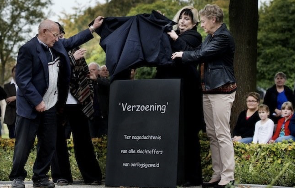
However, in Geffen, The Netherlands they ended up with a war memorial set in Comic Sans which isn’t inherently poor, it’s just probably a poor choice when you want to be a considered and serious and respectful. There was an (inevitable) backlash. It seems the rationale was it was comfortable to read at a distance, but as plenty of people retorted, so are plenty of other fonts that aren’t childish comic book scripts.
Typefaces and styles have connotations, some of which are obvious (or should have been to the people of Geffen), some of which are less so. It’s worth testing this, and even digging into the history of use (and even the designer too – I love Gill Sans, but when I read about Eric Gill, I didn’t feel like using it any more…)
Purpose: information or expression?
If you remember the shape of your spoon at lunch, it has to be the wrong shape. The spoon and the letter are tools. One to take food from the bowl, the other to take information off the page.
Adrian Frutiger
This is one of my colleague Fay McAlpine’s favourite quotes. What it is alluding to is that if type is supposed to be read as body copy, you shouldn’t even be aware of its presence; it should just do its job. So as a designer, you need to be aware of what you’re trying to do: convey information seamlessly, or evoke something more? Does it want to be expressive, or informational?
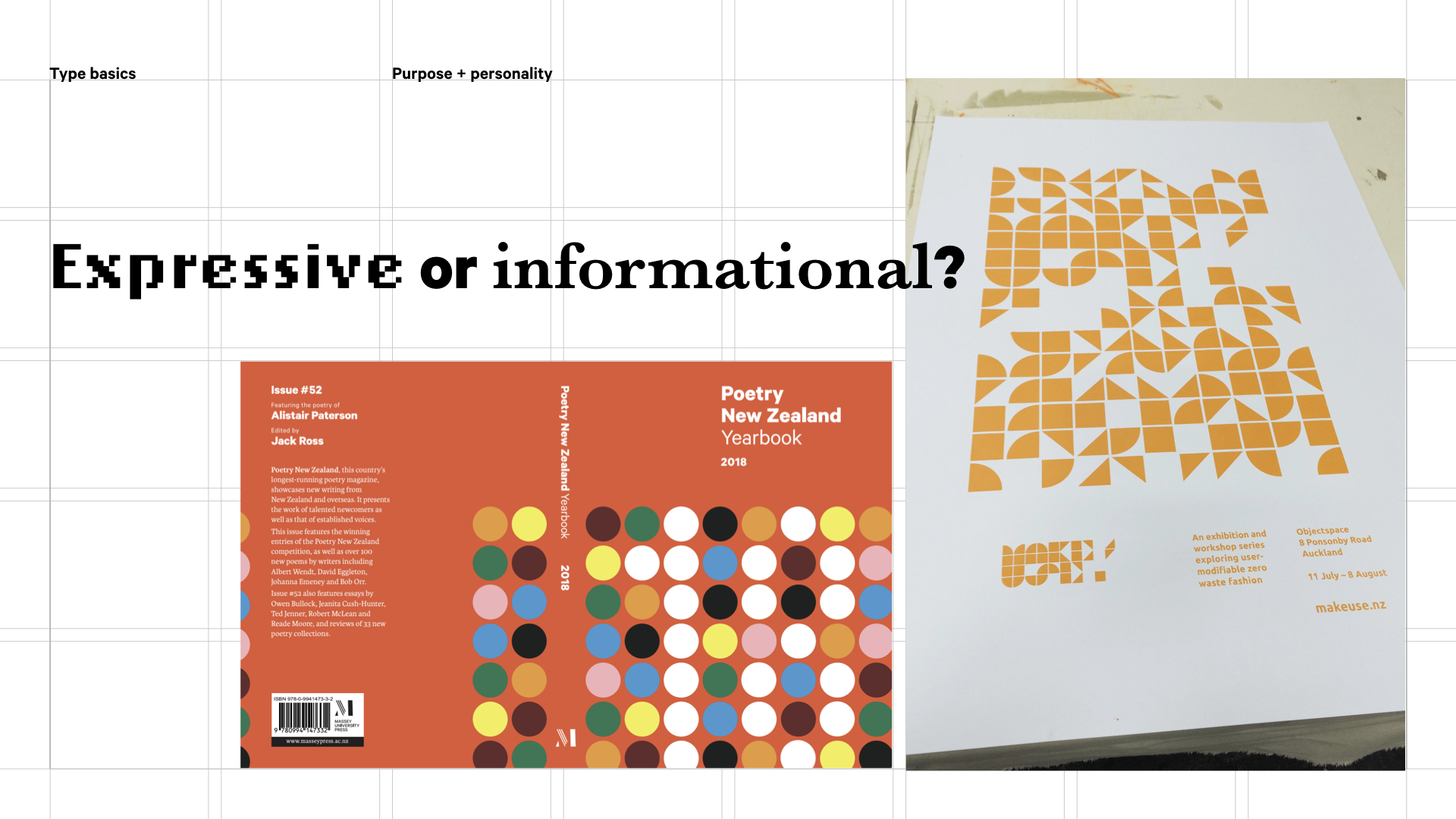
Poetry 2019, part of a series, and a poster for Make/Use
Above are some examples from my work where you can clearly see both expressive and informational type in both. On the poetry book cover, the dots make up the number 18, and Make/Use uses symbols from the zero waste garment system to form a modular typeface, but both are supported by carefully set text you’re supposed to read with no problem, carefully set on a grid system.
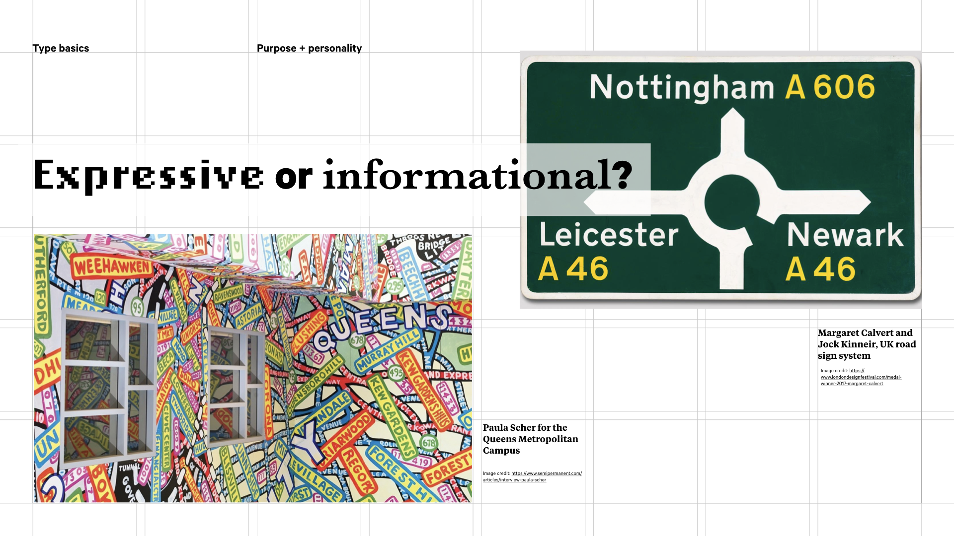
Queens Metropolitan Campus by Paula Scher and Margaret Calvert and Jock Kinneir's UK road sign system
In these examples above, the purpose is more single-minded. Paula Scher uses expressive, vibrant place names to decorate a building, giving it a distinct playful personality. Margaret Calvert and Jock Kinneir’s design of the UK’s road signing system (including the design of the lettering ‘Transport’) which came into effect in 1965 and still remains in place today is a thoroughly tested example of type that’s meant to be quickly absorbed and understood.
In summary
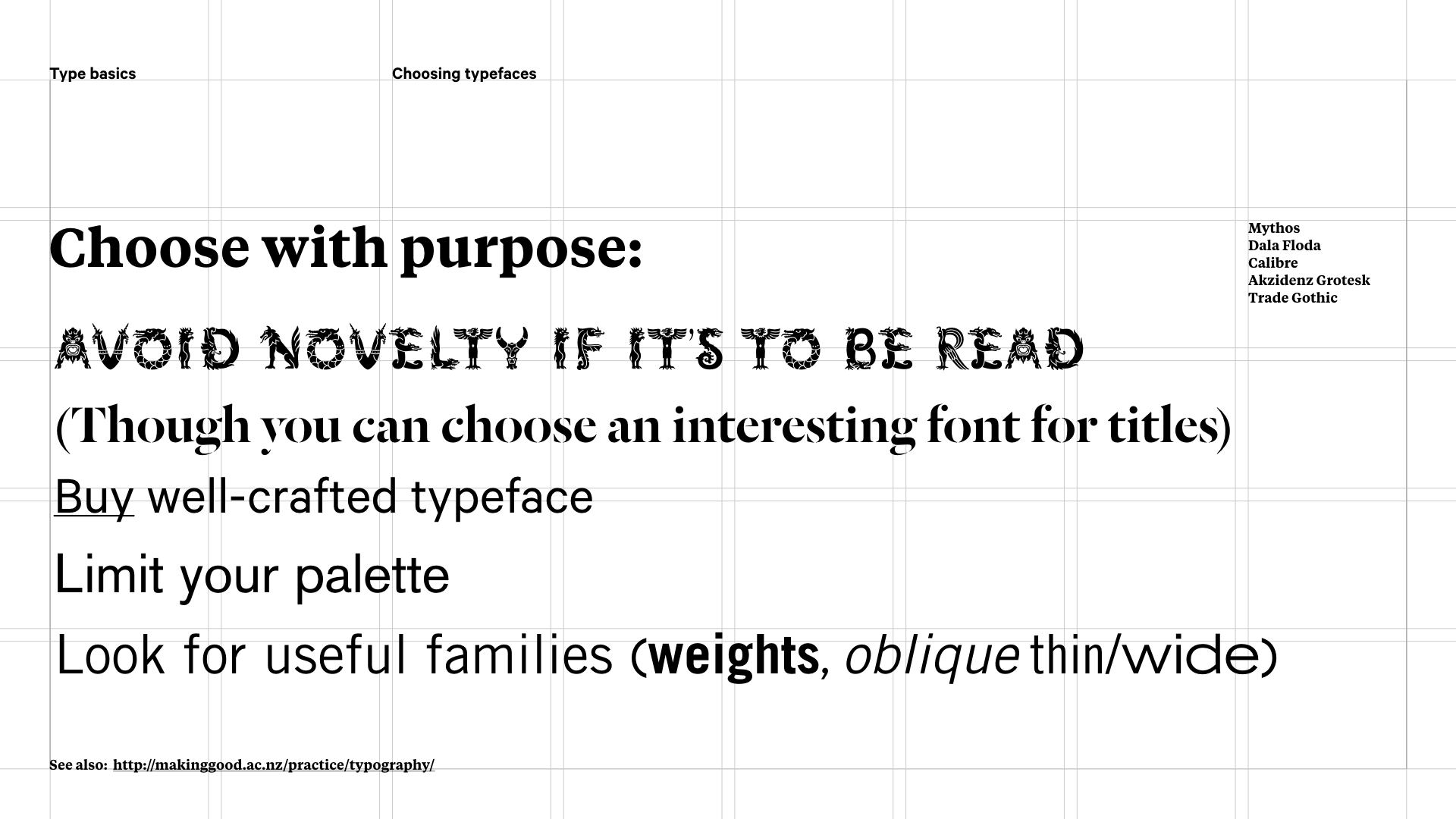
So in short, when you choose typefaces, choose with purpose. Avoid novelty, buy well crafted typefaces (and there are a lot of affordable options – Google Fonts is all open source and has some great type from some excellent foundries, and if you’ve had to fork out for an Adobe Creative Cloud account you’ll have access to Adobe Fonts with your – so when I say buy, I really mean don’t steal). Also, limit your palette and avoid using more than three typefaces in a system without really good reason. But look for useful families that have the weights you need.
And if you’re still feeling a bit lost? Here’s my top tips:
- first up think about the personality and functionality you want your project to have
- look at good examples that have a similar flavour and analyse what works and why
- don’t copy, but do look for similar qualities in typefaces that you might use
- test multiple options – you’ll soon get a feel for subtle variation
- test on other people just to check they get the same vibe
- You’ll end up with favourite fonts that become solid go-to workhorses
Now you’ve nailed the choosing. I will add a using follow-up when I get a chance :-)
