It does no harm to wonder / The Body of the Work
This publication was produced on the occasion of a retrospective of sculptor and College of Creative Arts colleague Richard Reddaway's work at Aratoi in Masterton.
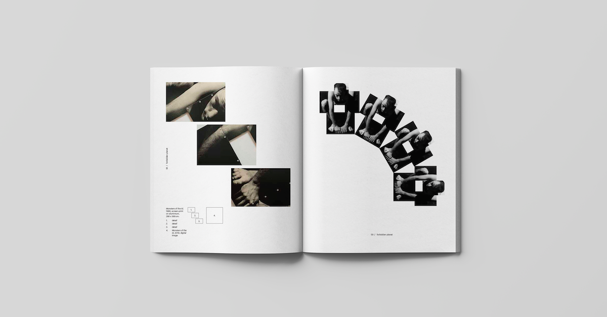
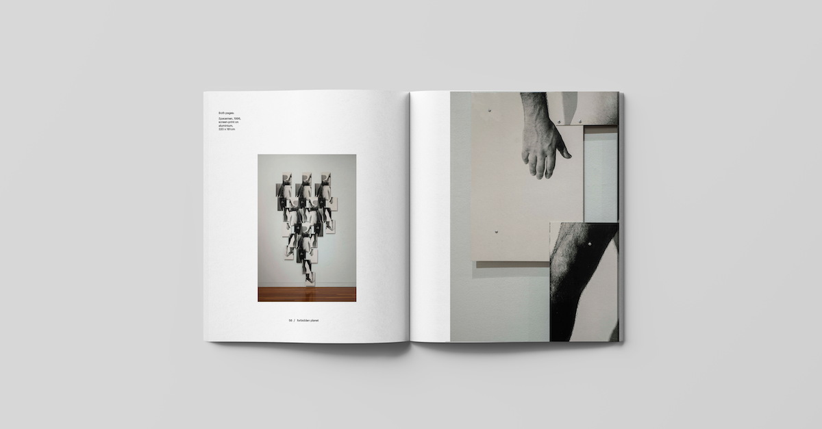
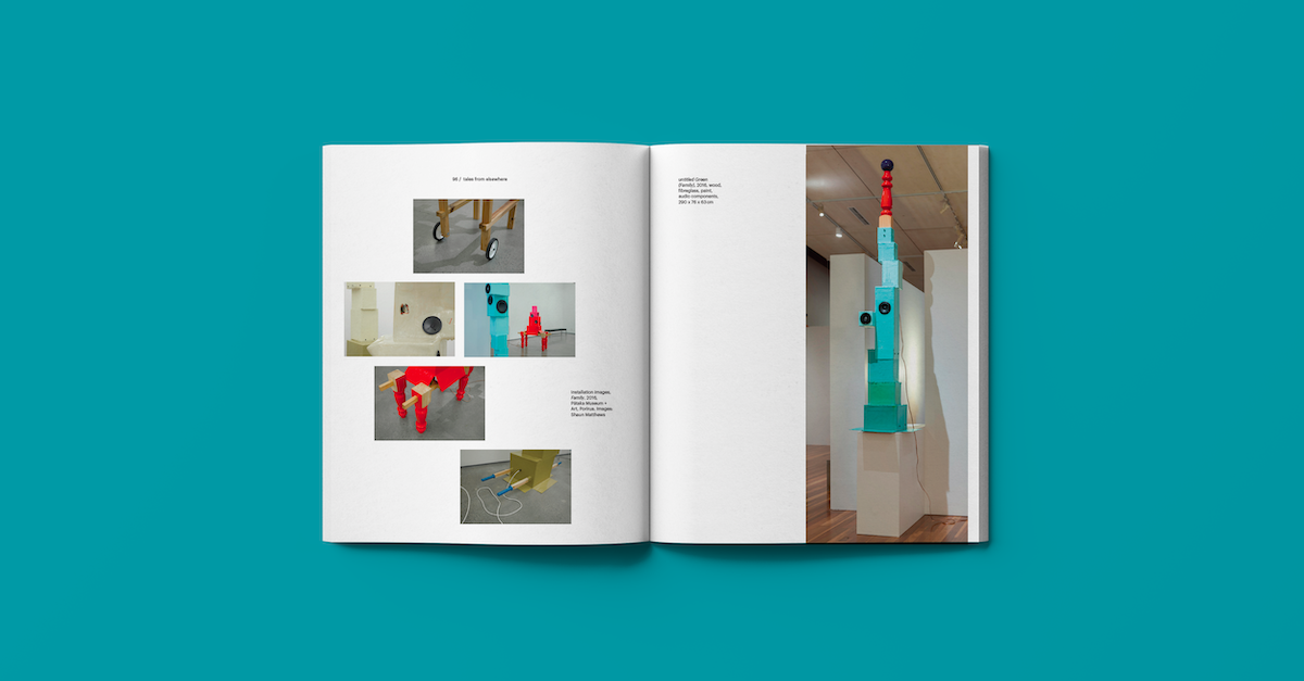
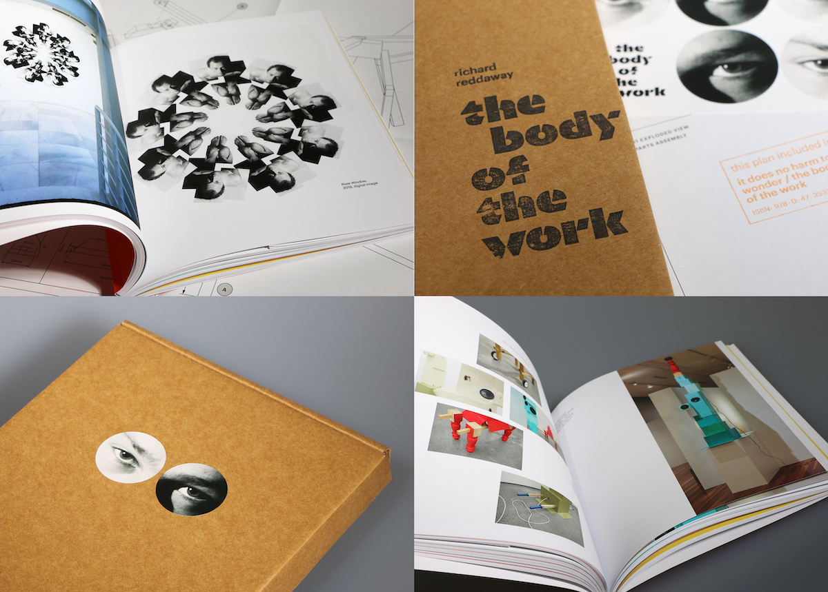
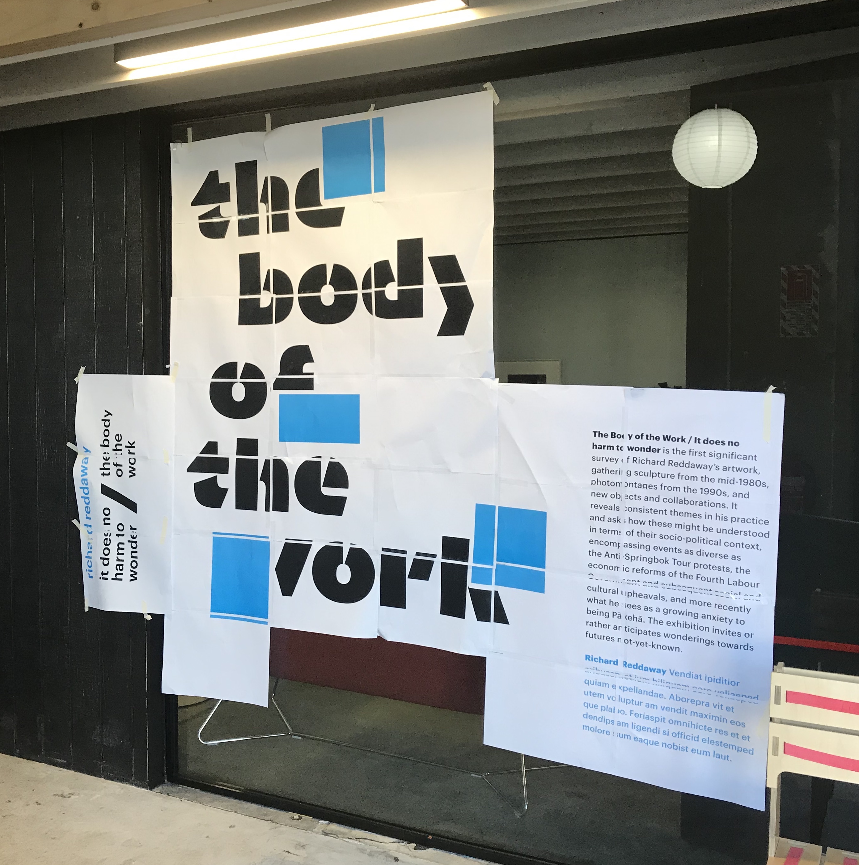
The exhibition surveyed Richard Reddaway’s work from the 1980s to his current practice, exploring enduring themes and tracking them in relation to the socio-political contexts in which they were made.
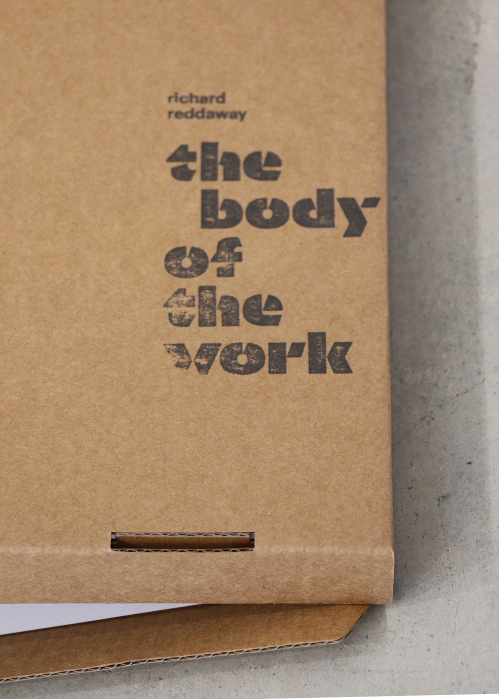
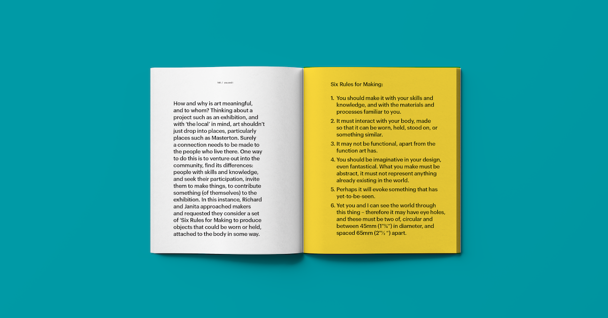
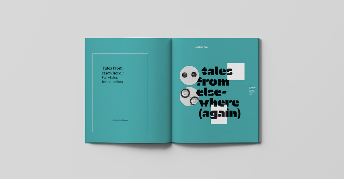
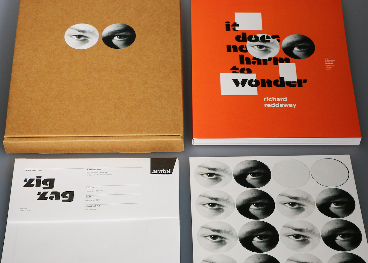
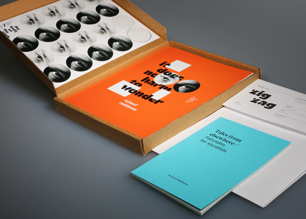
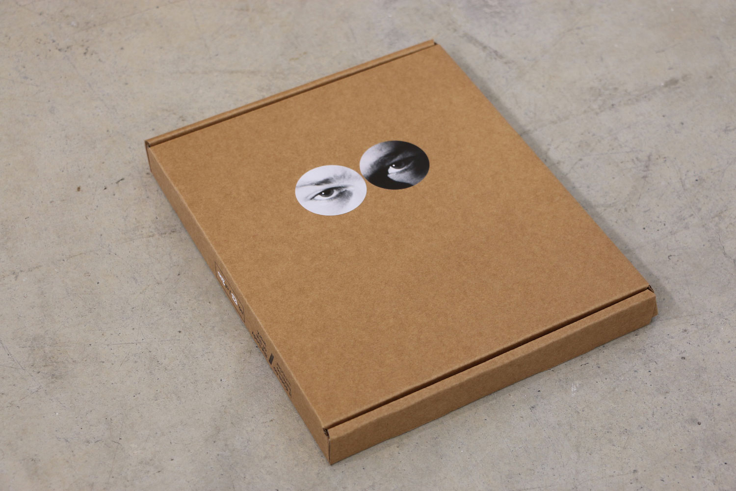
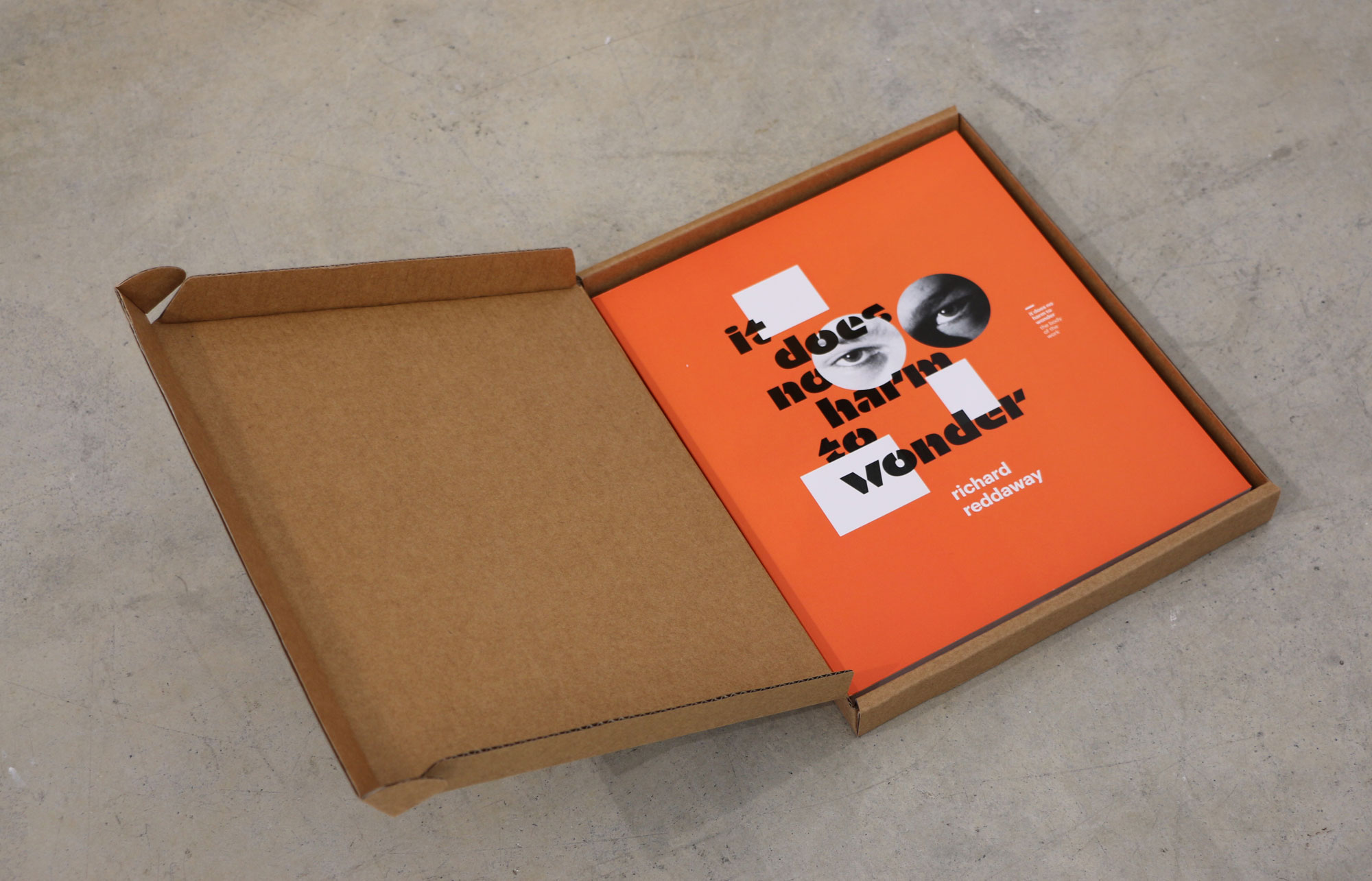
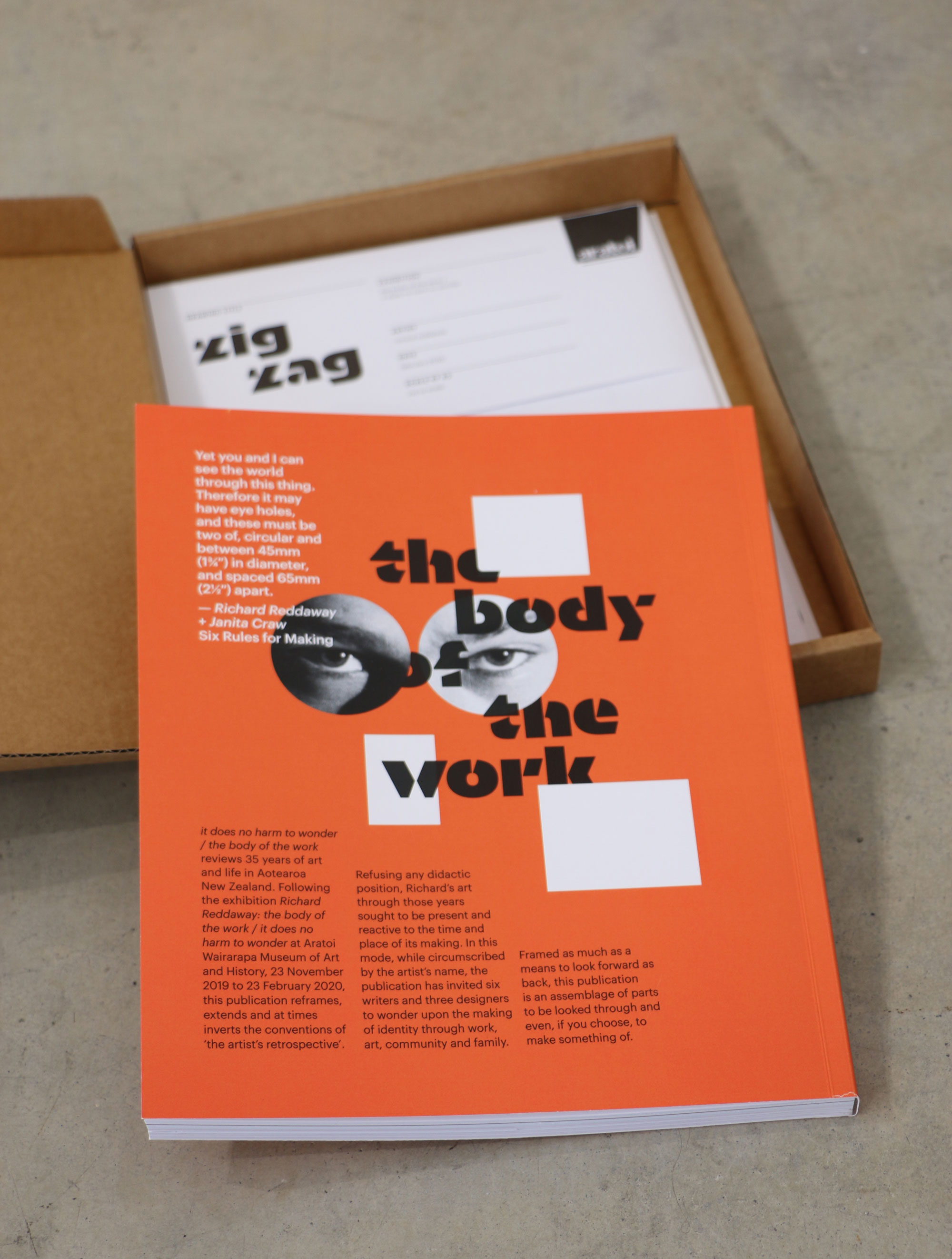
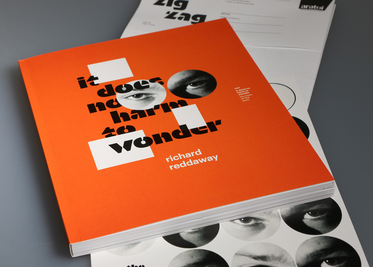
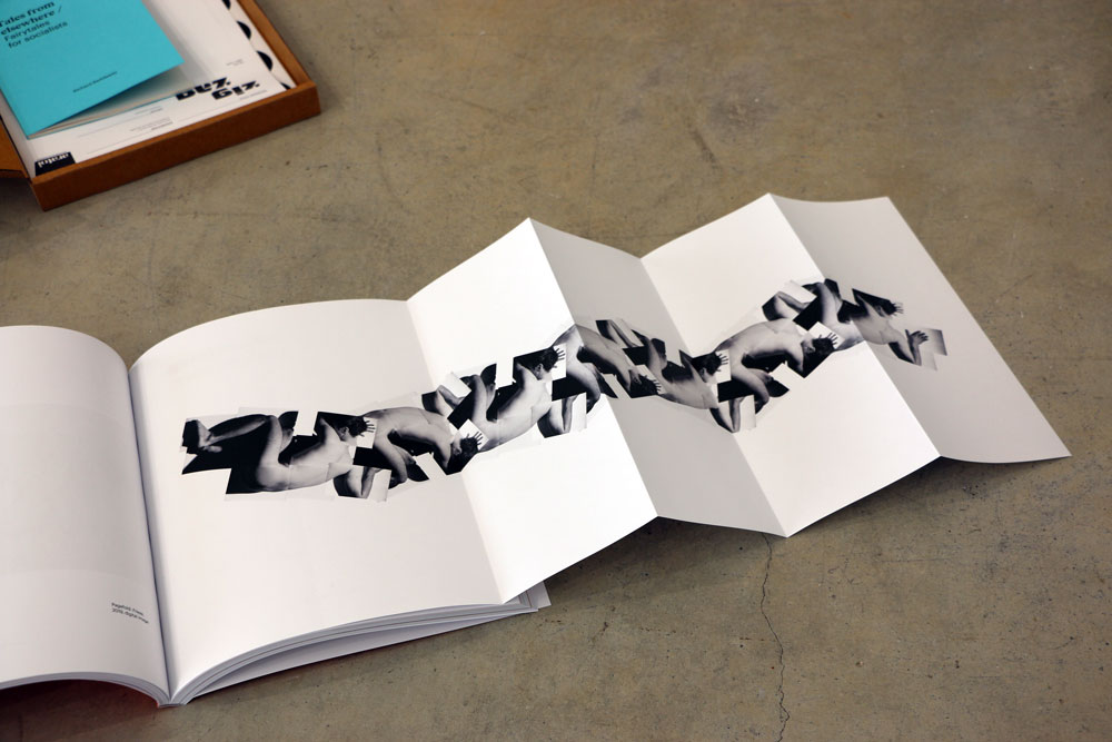
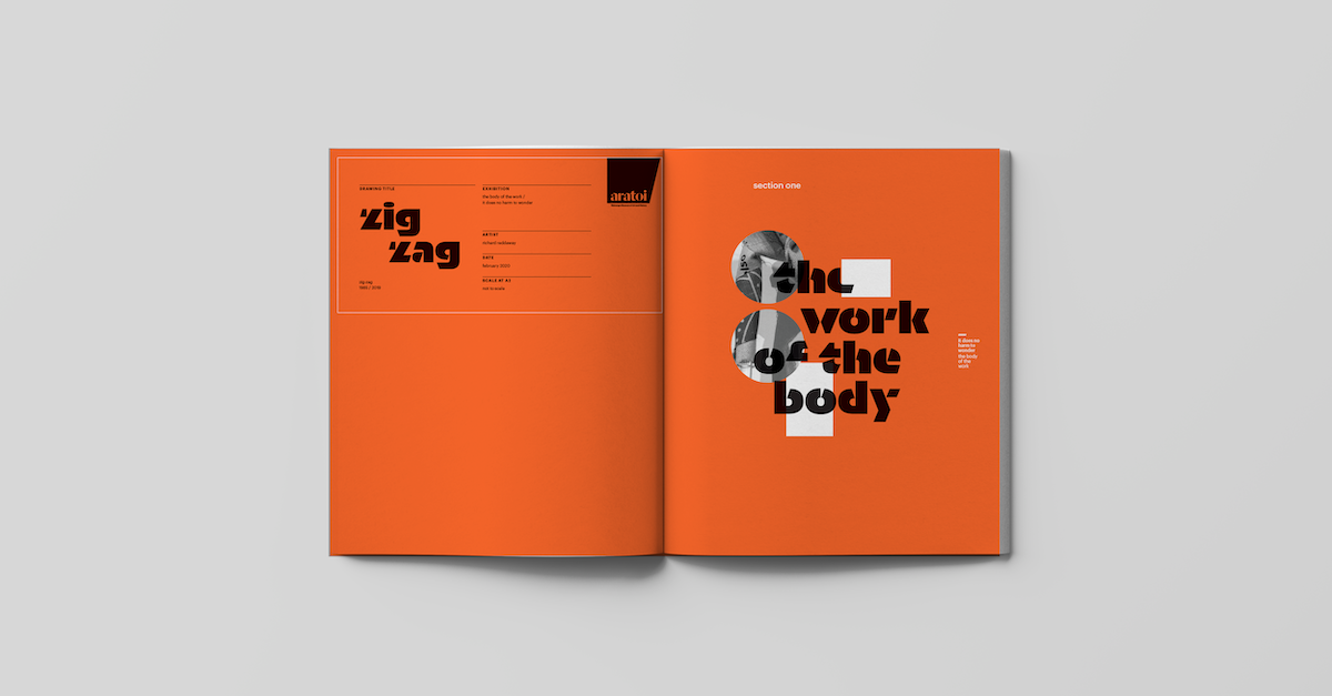
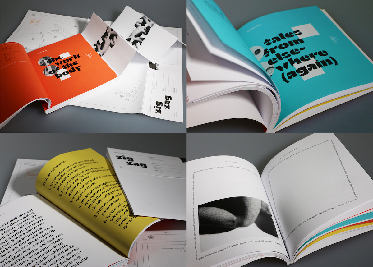
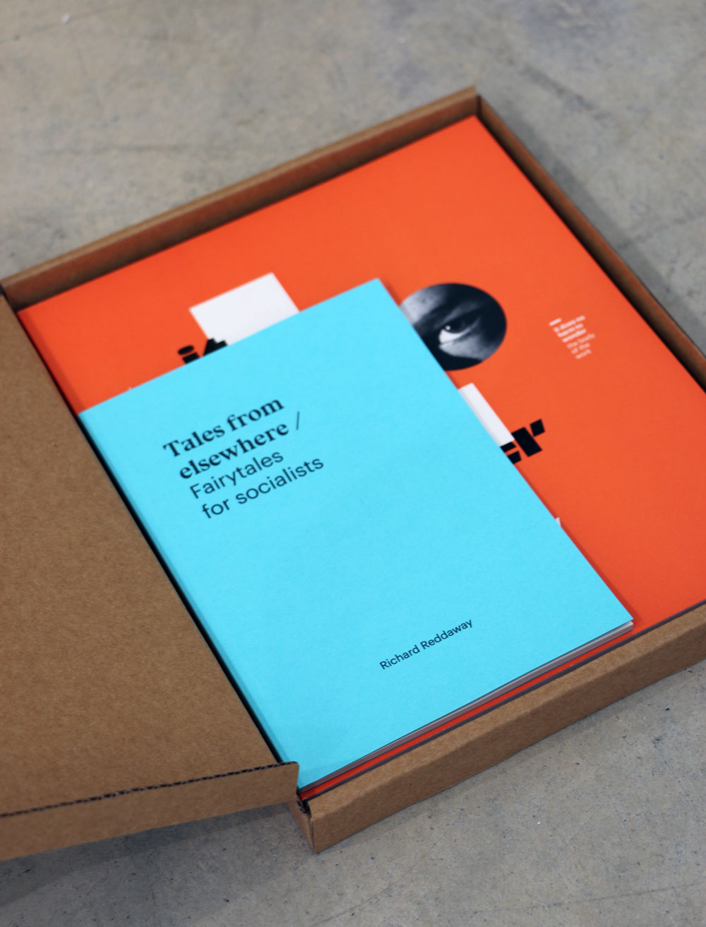
The publication (and associated exhibition graphics) were a collaboration with the fantastic Anna Brown. It is an assemblage of parts contained in a box with ‘eye holes’ (actually stickers of Reddaway’s eyes, remixing prior work and material use). We wanted to make an artist’s ‘book’ in the sense of capturing the art, but also extending the invitation for the audience to become enmeshed as maker in their own right. A sticker sheet is included, as is a plan of Reddaway’s ‘Zig Zag’ sculpture, in a playful invitation to extend the interaction with DIY: ‘parts to be looked through and even, if you choose, to make something of’, as Reddaway describes it. There is also a book of fairytales (designed by student Sarah Hall).
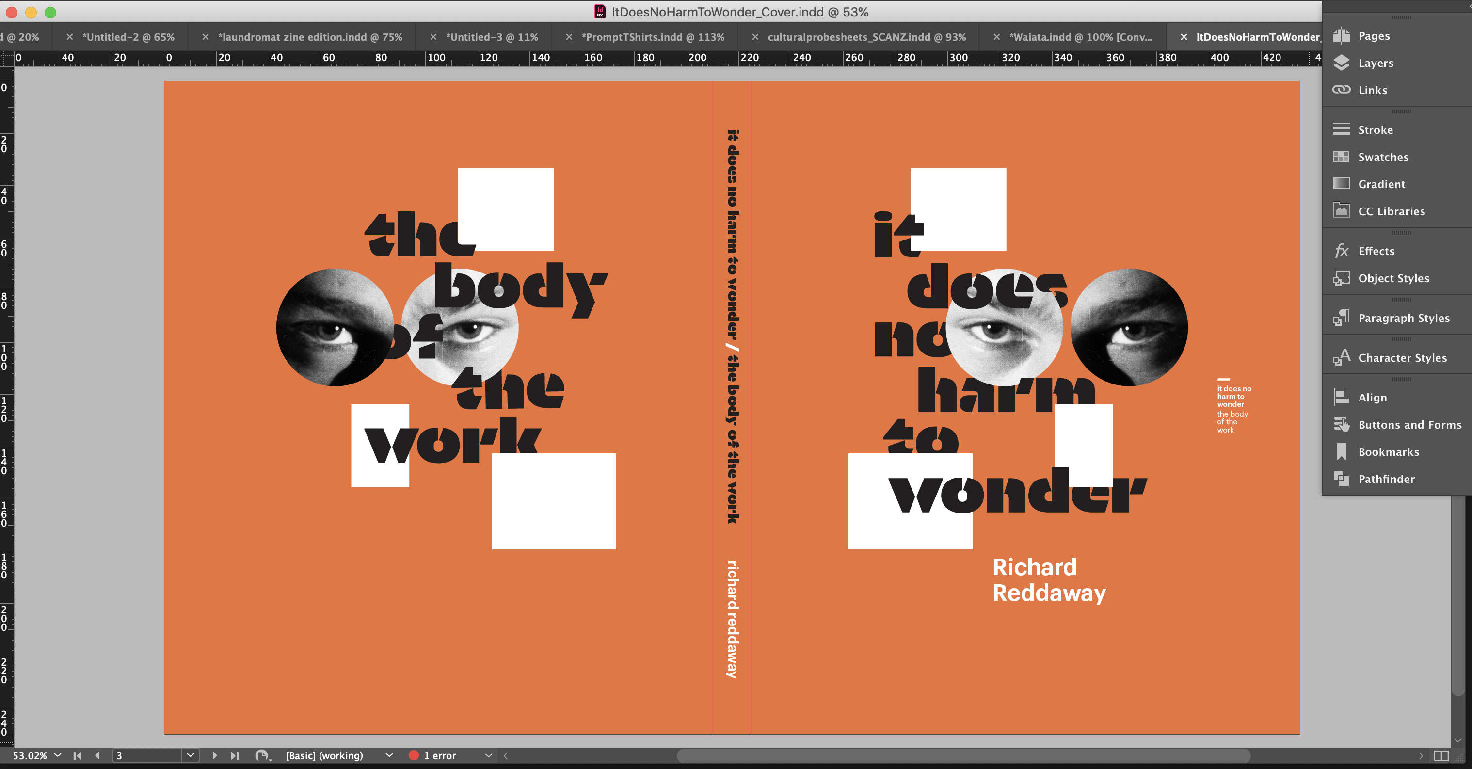
The main lock-up device uses Orientation by Commercial Type, which we chose because its angular stencil form lent itself to the overlapping and slicing we wanted to utilise to nod to Richard's work.
A review on EyeContact described it as:
…a remarkable publication, or rather a collection, as there is a lot packed into the box … The aesthetic of the book is a little Bauhaus, a little punk collage, a little Russian constructivist; telegraphing the underlying politics through art history, and this extending to the pageworks inside (some elaborately folded, playfully referencing the avant-garde political aesthetics of the early twentieth century).
Shortlisted for two PANZ Book Design Awards in 2021, the judges in the Best Typography category said:
The overall package is an avant-garde collection, celebrating Reddaway’s work in the maker-player mode of the artist himself. It’s eclectic in style – a bit of Bauhaus/punk/geometric. This is a visually stimulating piece of work that demonstrates considered typographic experimentation and craft. The materials, size, feel, layout, pacing, typography and colour choices all work very effectively to create a distinctive outcome.
And in the Best Illustrated Book category:
An art book that appears to be an artists’ multiple on first encounter: cardboard box, enigmatic eyes-on-stickers staring at you, opening to reveal book, booklet, poster and sticker sheet with more eyes (the two on the cover missing from said sheet, as if another reader, or maybe the artist himself, got there before you). The publication has an intriguing conceit, where rather than just being commissioned to design the book, the designer trio were invited alongside the writers to interpret the artist’s work: to literally wonder. A lively book results, where lines between artwork, prose, poetry and design are blurred, but everything is still held together in a pleasing tension with typography, form and material.
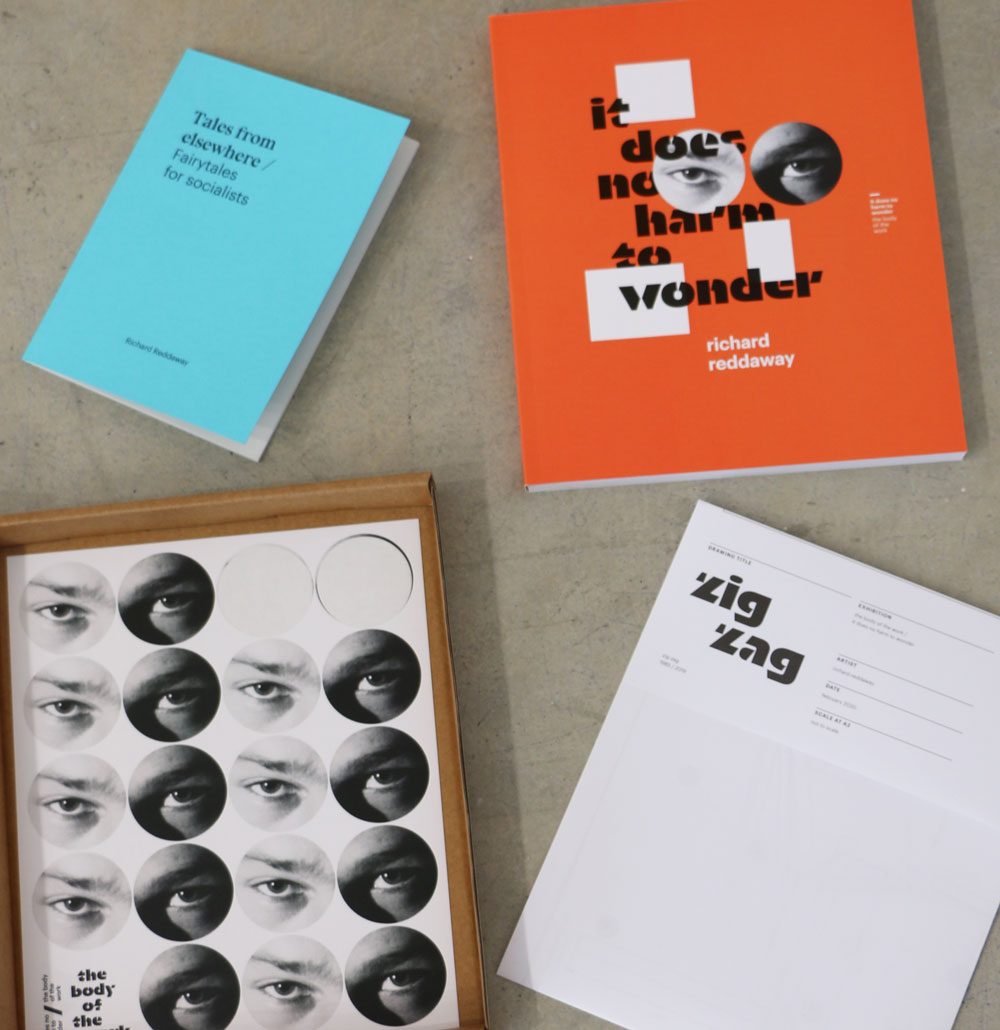
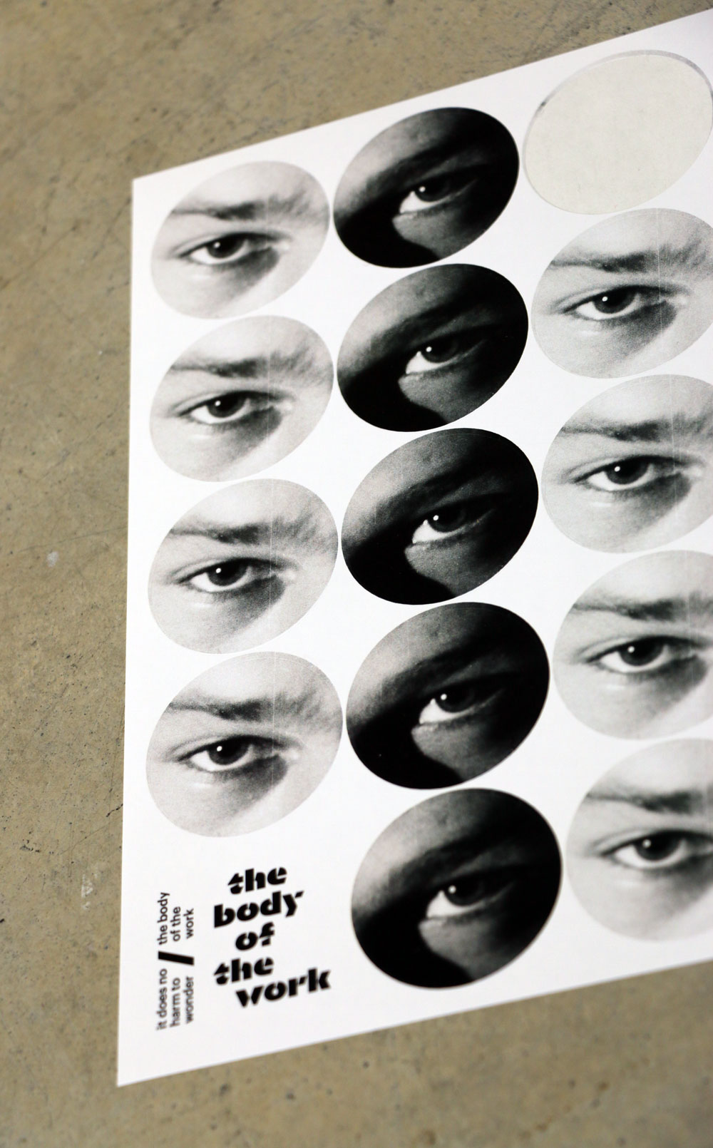
Sticker sheet
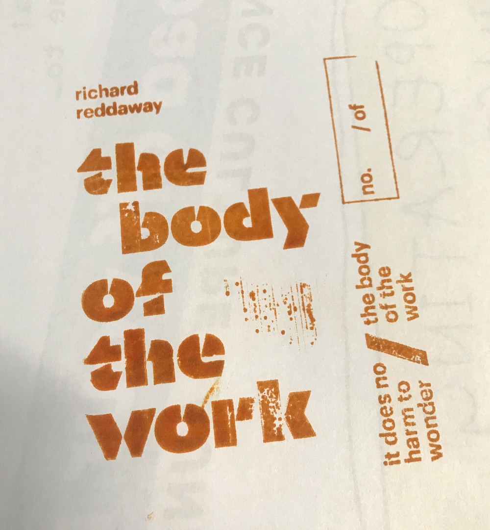
rubber stamp!
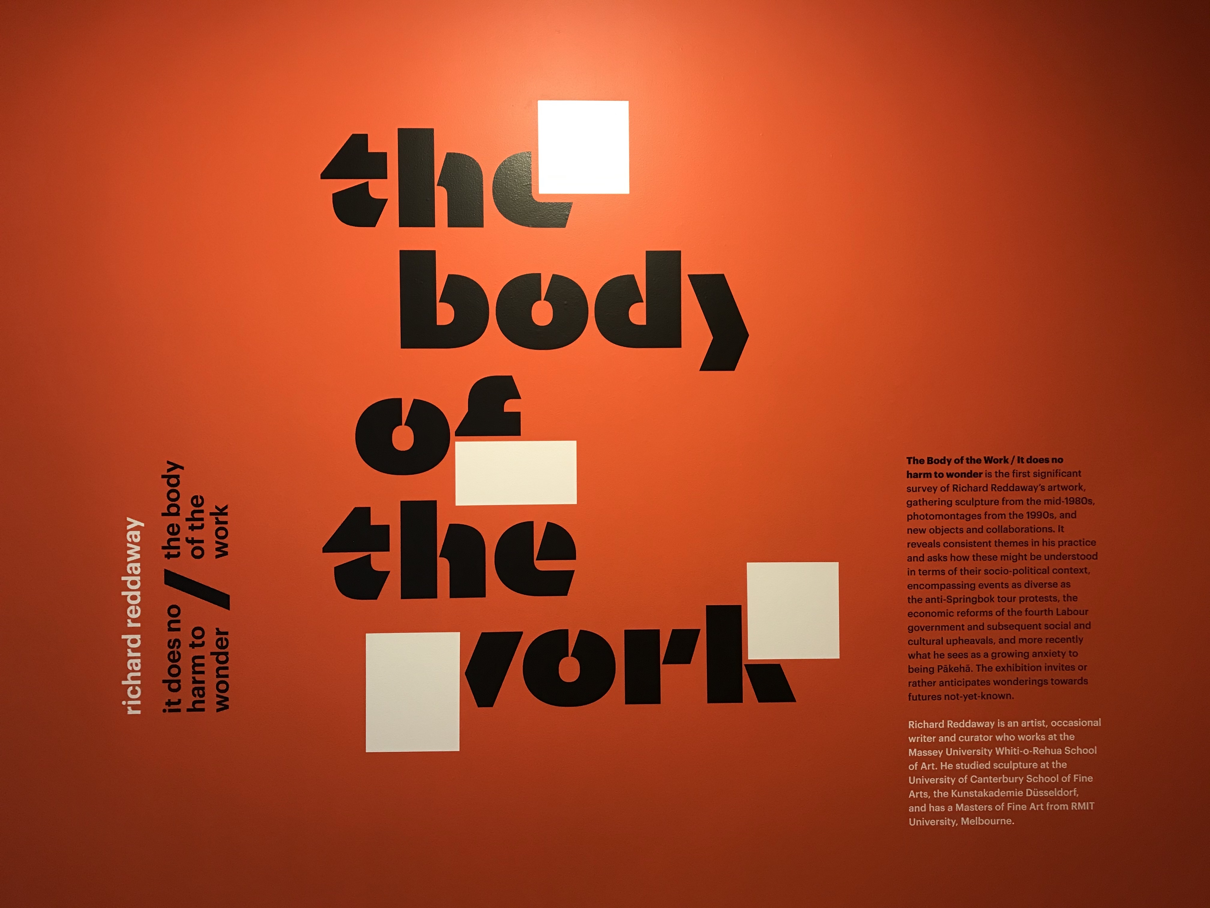
wall graphics in situ at Aratoi
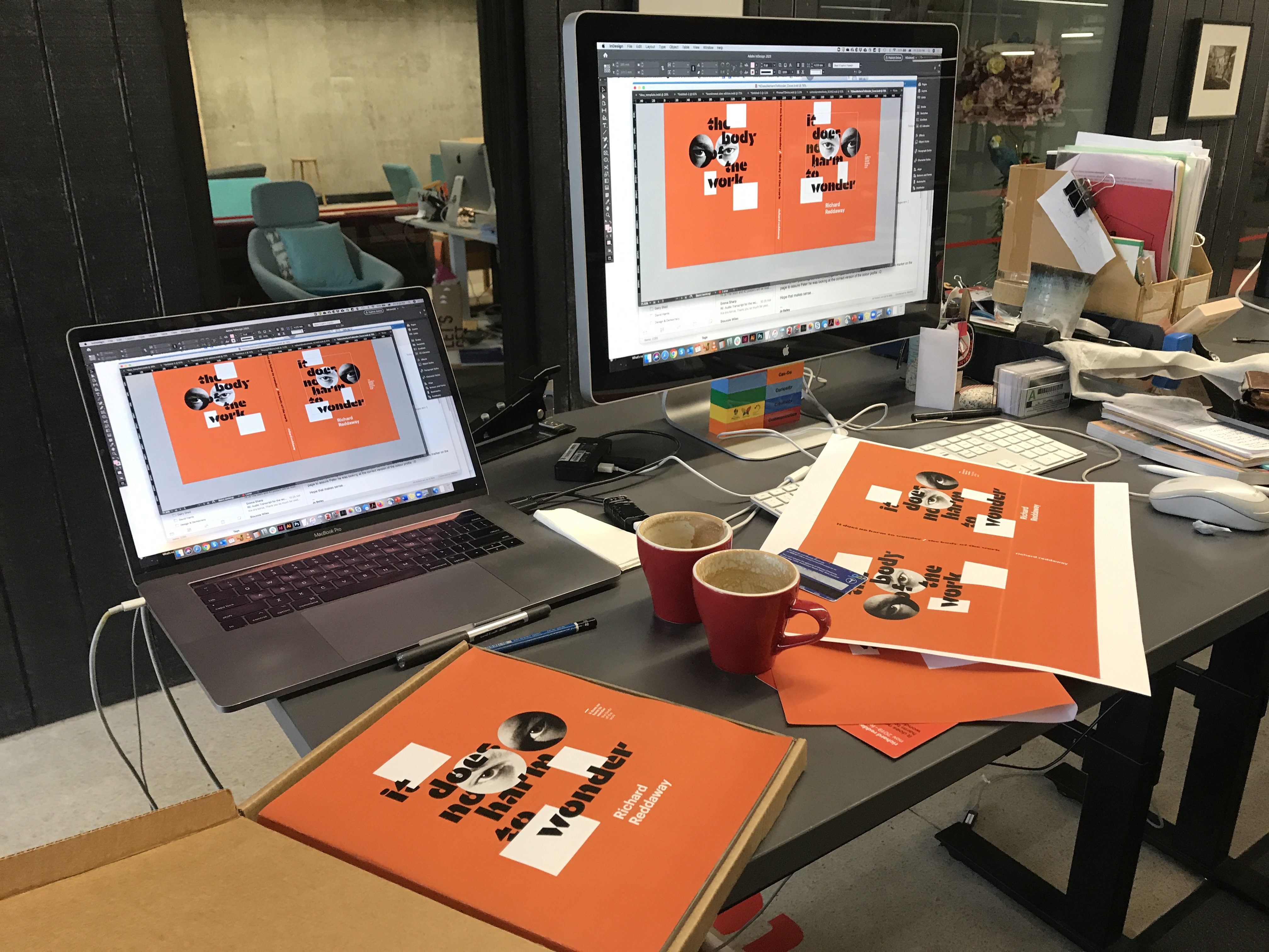
working on the cover
full size test for the exhibition graphics