Designing Extraordinary
This is a diary essay I kept while working on Extraordinary Anywhere, a book I designed with Anna Brown, a colleague and mentor at Massey. A heavily edited version of this (with some of the angst redacted!) was published as the design colophon in the book.
Packing
Seven years old. I am reading a library copy of Charlie and the Great Glass Elevator – dog-eared and patinaed by grubby hands – from our school ‘library’ (a bookcase that seemed at the time at least a storey high). I sit in the warm afternoon classroom, everyone reading silently, with a rising sense of anger and frustration. The vivid places in my imagination – a kaleidoscopic mash-up of Quentin Blake’s exuberant scrawl and places I know – feel mocked by the illustrations on the book’s cover that are just plain WRONG (sorry, Faith Jaques).
Perhaps this is why designing Extraordinary Anywhere is a little bit daunting. Though I said yes without hesitation when Anna asked if I’d like to be involved, I am trepid about attempting to render someone else’s place, squished, filtered and piped like a fat sausage out of my brain onto the page. I know the pain of an imagined world trashed by seemingly inappropriate visual language!
But, I content myself that the readers are unlikely to be petulant seven year olds with fragile psyches. Anna is unflappable and brilliant. Cherie and Ingrid seem genuinely delighted to have us working with them, though with an undercurrent of gracious and apologetic nervousness. They hover like protective parents. This is, after all, their labour of love.
Take off
Anna and I leaf through maps, encyclopedias and artists’ books. We Google and Pin. We visit Unity Books to scope the topography of the ‘New Zealand Non-Fiction’ table, where this book will peacock for attention with the rest of them. Then we start.
We read the essays separately, and we explain what they mean to each of us; a new landscape each time we talk. I get the computer to read them to me and I write down evocative phrases. A colleague sees the notes and thinks I’m attempting poetry (I cringe at the thought):
… Ring of statues
Lichen grown
Bus journey
Nostrils
Upstanding grim and grey
Pass through
Dead fish
Marking the shift
Flat tyre
Soggy paddocks
Cockles and horse mussels
Light planes
Make the pass
Brain of the dog…
Out of context, the phonoaesthetics of the words deposit new strata of meaning. Aloud (especially in ‘Alex’ the computer voice’s metallic monotone) they feel like the rhythmic clacketyclack of a train journey.
We settle on typefaces by New Zealand designer Kris Sowersby. We say it’s important that the text is set in type from here, but really that’s post-rationalisation. Tiempos is based on a typeface for a Spanish newspaper. Calibre, our sans serif, is inspired by street signage, and though this wayfinding lineage feels pertinent, it is happenstance; we chose it because we enjoy it; a consistent favourite, comfortable like my own handwriting. It’s the other way with Tiempos; we both fancied trying something new. Buying a new typeface ostensibly because you need it for a specific project is like convincing yourself you need new shoes for a specific event. A justifiable indulgence. Later, we add Domaine to the mix to up the elegance factor.
We try different formats and grids, leafing through paper mock ups, seeing where our thumbs want to grip the page. We choose a format we can imagine reading on holiday, for pleasure (Ingrid mentions ‘taking it to the beach’). There is something strangely nostalgic about it (I picture myself at a bach; an amalgam of places I’ve been and a sort of cliched kiwi summer holiday I never actually experienced). The edges of the page become the edges of a map, peripheral text set small and neat becomes our running header, but the asymmetric column layout leads the eye along the top then down the side. I twist the page as if lining up the map to find north.
We all agree, this is a green book. We don’t all agree on the same green, but our instinct is the same. We pick a sprinkling of tabs from the Pantone swatch book. Lush forest, earth and moss. Anna and I find an old cover of the Hobbit in a single tone somewhere between greenstone and grass. It has grid lines and a map of Middle Earth, and lettering in caps. We both love it. To me it has something quintessentially English about it, which I quietly enjoy. I read the Hobbit as a child in rural England, so that’s where Middle Earth remains, despite my adopted homeland’s wholesale adoption of it.
Anna and I try layouts in various greens, but they are wrong. It comes across hackneyed; too obvious and literal and a bit muddy and murky. We all agree, it lacks elegance. We look through more vintage book plates, and find old building blueprints. Deep blue pages with complex details. It falls into place – the Hobbit cover is right in that our design should be a simple, single colour, but it isn’t green. It is blue, Pantone 315U blue. I tear out the swatch tab and put it in my wallet.
Full flight
Tentatively, I illustrate some essays, pulling together words and found images to create assemblages to augment the words. I enjoy the process of digital collage – the way it can create a narrative through bringing the ephemeral together to tell a new story. Puerile but half true, I retrained as a designer because I’ve always loved sticking pictures of people's heads on things to make ridiculous montages. Terry Gilliam was my favourite Python. Ingrid and Cherie like some of the images, politely reject others with faint praise, but it’s a start.
We decide to try choosing an emblem for each essay. We have agreed to make some postcards for the Ohakune Readers and Writers Festival – publicity for the book in advance of publication. I think we are doing four. Anna thinks we’ve agreed to do the whole set. She’s right. Shit. A frantic collection mission ensues. I fossick for out-of-copyright images on the internet. I look for something that exists in my mind, but find something else, and the current swirls me in a different direction; a psychogeographical dérive across the internet. Together with the aid of Google Docs, phone calls and a back and forward email trail that nears three figures we settle on quotes to go on the front of the postcards, and start to choose illustrations to join them on the reverse. Some are easy, others more opaque.
Ashleigh’s airfield, 'just another paddock, the planes large animals' brings to mind wildlife documentaries; helicopter shots of giraffes lolloping in slow motion, awkward and graceful concurrently. We fuse together a giraffe and a plane, and a handgliging hedgehog made from a dinghy sail and nature print for backup.
Sally talks of dancing and music in response and defiance after the Christchurch earthquakes – 'facing catastrophe with a song and a beer in hand'. In a collection of old geological prints I find the words ‘Signature of Earthquake’. In seizing joy through shared song, Sally shows music became the signature of the earthquake. We attach the words to an excerpt of a musical score.
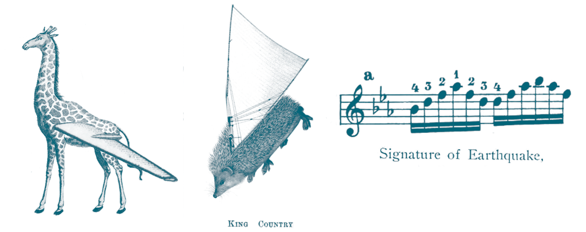
Images for Ashleigh and Sally
Cherie’s essay is one of the most visually evocative. When she talks of the Napier earthquake thrusting the seabed skywards leaving dead fish and horse mussels – having never seen a horse mussel – my mind fuses together a peculiar equine/shellfish chimera. We recreate it with images from old encyclopedias.
Tony describes his mother buying Chinese vegetables, and the ‘profound localisation’ of Cantonese cuisine at Fairways. Chop suey patties, an entwining of two culinary cultures. I recall a beautiful image of a garlic bulb I have seen in a gastronomy book plate. When Tony talks of knots as a metaphor for the nature of place, I picture this garlic alongside nautical knot patterns. We collage the two; a family crest of sorts.
In Lydia’s essay, the 'stump of a tree felled by adzes … preserved, labelled, and protected with a little tin roof' gives rise to a montage from a pruning manual and an architectural diagram. Though a literal illustration of words, it appears an incongruous and intriguing juxtaposition.
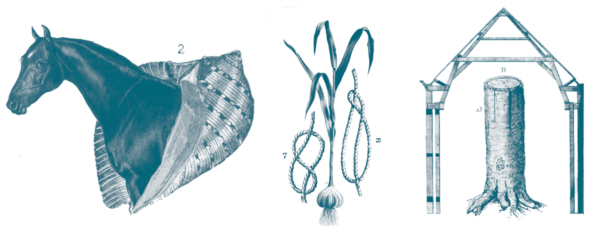
Images for Cherie, Tony and Lydia
Ingrid’s essay is one of the few that talks of places I know first hand. I picture my daily routes through the spaces she describes. I choose an owl, a sentinel on the carillon tower for knowledge (mine, expanded with a new dimension on the familiar), but also because of the Laurence Aberhart stuffed birds she mentions (I recall a photograph of a parliament of stuffed owls in Te Papa from a previous project I worked on with Anna). I have my own moment of cultural awkwardness. We choose a European owl purely for aesthetic reasons. When I contemplate the decision it seems incredibly ham-fisted. Second time around, we eventually find a ruru.
Provenance and lineage become pertinent again in Alice’s essay. The ‘gathering place of eels’ is such an evocative image it is the obvious choice for illustration. We track down beautiful pictures from old natural history plates: conga, electric, moray… emphatically not native! Ingrid gently but firmly insists they should be. She is right. We sift until we find them.
Annabel talks of peaches in her essay. Easy – botanical illustrations are plentiful. Later though, Ingrid suggests a house might be more appropriate. Immediately, I think of an image I had seen a few months previously. Whilst browsing a bookshelf in a bach, I had happened upon a picture in a Bill Toomath book of house that could be ordered from a catalogue. By chance, I have a small wooden brooch that depicts the same house (with very minor alterations). I track down a copy of the book, and when I find the image is from the Dunedin Iron & Woodware Company, and depicts a ‘stock cottage’ from the 1880s – just when Mary Lee in Annabel’s essay was herself arriving in Otago – I feel quite high on the serendipity!
After reading Alex’s essay, no single literal image materialises for me, though I try out and discard several. In the end, the sense of the road, the journey, the map – these are what it tells. We choose a scale symbol from an old map.
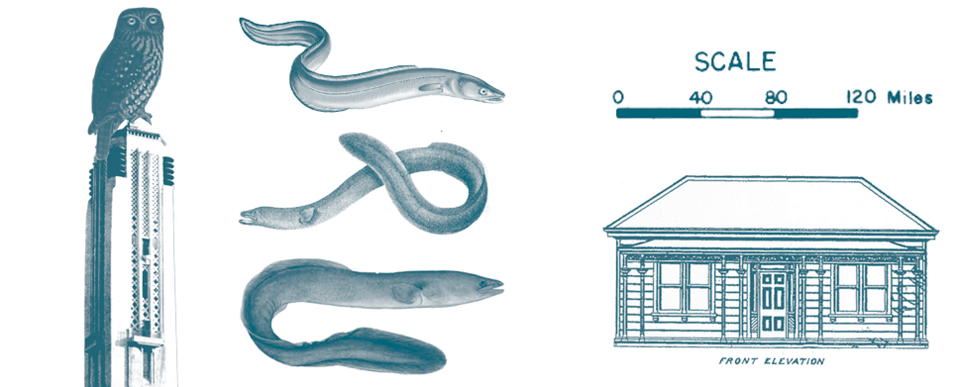
Images for Ingrid, Alice, Annabel and Alex
Jack’s nose-cauterising operation strikes me particularly vividly. In my mind a strange victorian scene – shades of Frankenstein’s monster strapped to the table – with archaic medical implements. I find some kind of probe and a pair of surgical scissors in a medical textbook alongside scalpels, kidney bowls and pointy instruments of unknown purpose. A grim toolkit.
I find Harry’s essay moving in a way I can’t put my finger on. I want to capture some of my ephemeral feelings in an image, but I can’t quite seem to grasp an idea enough to tether it. We settle on planes ‘… the distant drone of planes leaving Heathrow’.
Lynn’s essay challenged me. I resort to Google, as my grasp of the notion of a taniwha is sadly lacking – it feels awkward to attempt to illustrate something so on the edge of my sphere of understanding. I take a literal tack – diggers, shovels, the ragged horses. Nothing sits quite right. I read again, absorbing the story of the expressway folding out over months, cutting a trail through the landscape. The words unfurl. I picture a snail, quietly meandering, feelers flicking and probing, making a trail over moist earth, a koru shell. We find an image, delicate and elegant.
It is a feeling too that conjures images for Tina rather than concrete objects. I have a palpable sense of a void between two magnets, held in tension; two poles in balance, repelled but attracted. Trouble is, I can’t make this materialise on the page. We try compases (magnetic and mathematical), circuit diagrams that look like weaving, and illustrations of cosmic voids. But it’s an image of a tightly wound watch spring that entices the most, largely because it is rather beautiful. We flipflop about its relevance, but if anywhere that tension is justified, it is here.
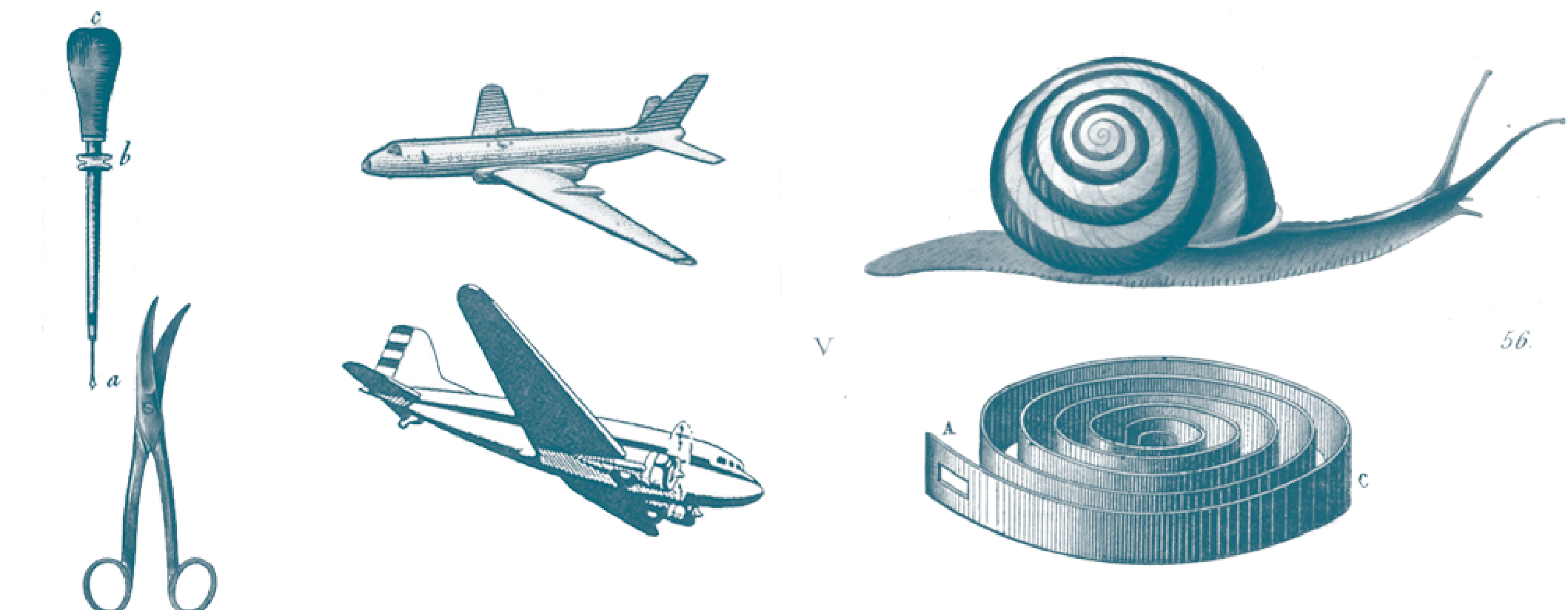
Images for Jack, Harry, Lynn and Tina
Ian’s was the first essay I read. When he talks of an 'Australian eucalypt whose roots are pushing up the pavement', and in the next sentence of 'botanical topography', I immediately think of tree rings, and the way they have always made me think of contour lines. By the time he mentions the ‘real wood’ on which the Middle Earth stamps are proffered, I know what I am looking for. I find it – ready scanned and packaged for me on a website of vintage prints. A beautiful slice of ‘real’ tree.
For Giovanni’s essay we place an all-seeing eye in Google’s map marker. I made this as part of a collage early on, the pin casting a long sinister shadow over a pile of Giovanni’s holiday images. It doesn’t seem to make sense to anyone but me, so I cast it aside. Instead we use a camera, but I put a globe in its lens – Google’s lens on the world, or something postrationalisationy.
Tim’s image feels like cheating. I find a globe in the reams of resources I’ve collected over this project and during my Masters a couple of years ago. Ingrid and Cherie like it. I feel like I’ve just downloaded a stock image, but I tick it off gladly.
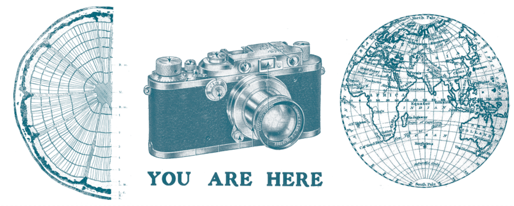
Images for Ian, Giovanni and Tim
It comes down to the wire, but we meet the print deadline, and the postcards make it to the festival.
Turbulence
By April we have been working on and off on the book for six months. We have a couple of meetings in which I find myself coiled like Tina’s spring; tense and agitated. At the first we show Ingrid and Cherie a dustjacket concept that unfolds like a map to reveal a system placing each essay on a grid based on its location in the book. It is unresolved, but it resonates with me particularly deeply. The tactile exercise of unfolding and refolding (the frustration of a map that won’t obey the creases), the wayfinding system, the bringing together of all our symbols. The response is polite but lukewarm. I rap my fingernails either side of my computer trackpad and scowl. I feel Anna’s disapproving stare. I am frustrated, but can’t put my finger on why. I’ve had difficult client meetings before. I am usually adept at teasing out what is required. I grit my teeth. We try again.
This time, a typographic approach, and the pressure of a cover proof needed for promotion. Here come comments of corporate meh and blocky, modernist type (not a compliment). I am tired and dispirited. Another meeting, this time at VUP with Cherie, Ingrid and Fergus. It is cordial. But when Anna says we could try another colour – we can try anything they want – I suppress the rising frustration of the seven year old me. I feel myself clack clack my nails again, agitated. It strikes me, sitting there, that I am no longer daunted by how to illustrate other people’s places. I am so embedded in this as a process, so involved and so deep, that what I am trying to do is render my Extraordinary; my journey. I have become territorial. The book is my map. The map is my territory.
Anna emails more concepts to the group. Ones that we haven’t discussed with each other. A different typeface, photographs. A shock in my inbox. It feels like a betrayal, but I know it was necessity to share something with Ingrid, Cherie and Fergus. It’s not that I dislike them, but they just don’t feel … extraordinary … Extraordinary. It doesn’t feel like a collaboration any more. My eyelids prickle. On email I share the words I have typed in this diary by way of explanation about why I probably seem grumpy and petulant. Anna emails the wider team, explaining that these new covers were a misguided step driven by expediency. I am flooded with relief – less about the covers, more that I’d have been bereft at the loss of our relationship – our collaboration – if we’d left it there. The next day, we hug and move on. The responses from Ingrid and Cherie ooze anxiousness and ultimatum. Get this done – ‘we can’t wait forever’.
We find time for another day of iterations – seven straight hours punctuated by a working lunch with covers spread across a cafe table. One of our lunchtime iterations is a giant E with an owl in it. It’s faintly ridiculous, and makes the B pile. However it’s capital letters we come back to, in the ‘new’ typeface Anna had used, and by 4pm we have renamed another version ByJove_IThinkWeHaveIt.indd. We have done another loop around the track, and feel elated. We decide to send only this version. This is it. The responses come back positive, with a joyful exclamation mark. Yuuuussssss! Relief.
Landing
After the high, back to the typesetting grindstone and the juggling other projects. We spend another solid day, turning into a Friday evening. Beer bottles and chocolate wrappers strewn across the desk. Anna multi-tasks masterfully, marking up proofs for other projects, squeezing in a mad dash by bike to press-pass another book, managing artists’ egos. Even when distracted her eye for detail is much better than mine. I furrow my brow in concentration, stare at the screen and marvel at her plate-spinning. We eventually – late as always – send proofs to the team. But for the back and forth of minor changes, we’re there. Anna whirlwinds off to another engagement. I step out into the still dusk, and go to the pub.
Unpack
This has been a unique process; both the design process and writing about it. Thoughts pouring out through my fingertips feels confessional in the way I imagine keeping a journal might be. It immersed me, winding the bond with the project tighter and making me overprotective; defensive. Then, in retrospect I reread and get some perspective, catharsis. This isn’t my book. It isn’t about me. But it is, too. It’s about all of us.
I scratch about for somewhere to terminate this diary I never meant to share. Collective journey; winding road; endurance expedition. Cliches that tell me to stick to the visuals! In the end though, I’m elated at what we made. A story told, a geography mapped. A new – and extraordinary – place made.