New work: Thomas Ward's Map
Back in August 2024, Nicola Legat of Massey University Press mentioned a forthcoming book about maps and asked if I’d be interested in designing it. ‘Of course!’ I said — I love maps.
As a geography-graduate-turned graphic designer, it could not be more my territory. When she said it was written by Elizabeth Cox, the historian who wrote Making Space, I was doubly on board. That’s a great book, and it also features Jessica Halliday (one of my favourite people), who spoke highly of Elizabeth.
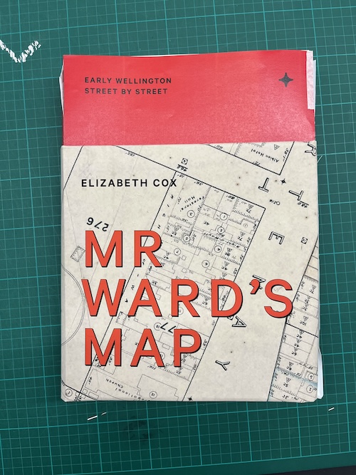
Therein started an epic piece of work, building on an exponentially more epic piece of work that Elizabeth undertook to research and write the book. It’s called Mr Ward’s Map, and it is a fascinating street-by-street social history of Wellington from 1890 to 1900 (a period of huge change), which was documented in 88 sheets of a giant map of the whole city (as was then), drawn for the City Council by surveyor and engineer Thomas Ward.
A map of epic proportions
These map sheets are, themselves, epic. Each sheet is about A1 in size, now carefully housed in archival drawers in a warehouse near the Basin Reserve at Wellington City Council Archives. The map recorded the exact footprint of every building in the city—every commercial building and every house, every garden shed, stable and outdoor toilet. As well as a building’s shape, Ward recorded the number of its rooms and storeys, and what its walls and roof were made of. Elizabeth has uncovered the stories of the people in those houses through meticulous archival research and has pulled together around 500 photographs to bring those stories to life. The maps were literally a five-minute walk from my university desk. That—and the fact that where I work is near the centre of the Ward map—felt somehow prescient.
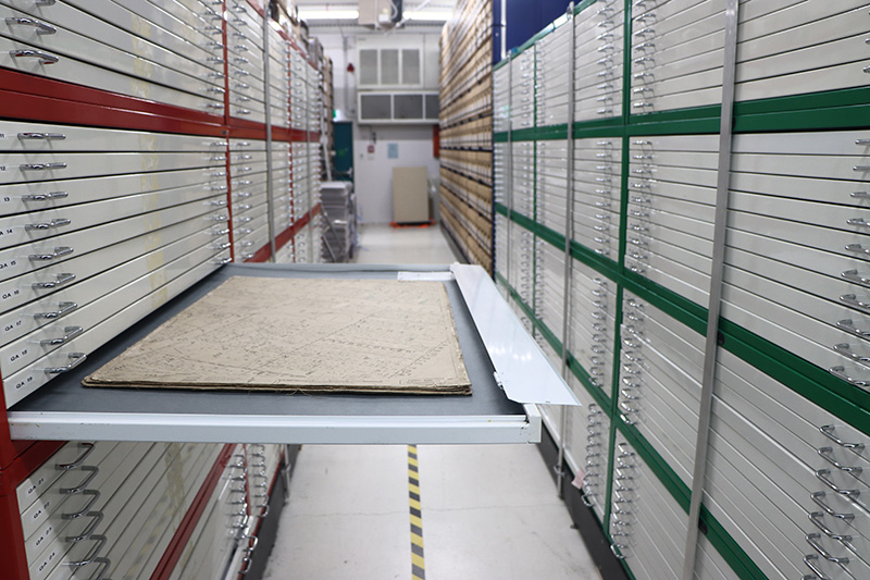
A drawer of map sheets in their archival home. © Tristam Sparks
Mapping a process
It’s been a really great process to develop this book. I’ve dived into the history of map typography; pored over photographs and made countless mock-ups. Elizabeth was generous and trusting of me as a designer, given the immense labour she put in to create the manuscript. Nicola Legat and Anna Bowbyes from MUP were, as always, great to work with too. Sourcing all the high-resolution images alone was a huge undertaking.
Another delight has been working with Peter Miles—our genius technician in the photography department at Massey—to do the pre-press work on the images. I say ‘working with’, but to be honest my role was mostly to look on in awe, saying things like ‘Wow, look at that!’ and ‘No, I think that’s still authentic,’ when Peter asked ‘are we telling lies now?!’ as he drew detail out of photographs so they would hold up in ink on uncoated paper, while we looked at them on his high-res monitor up close. Peter really cares about this work, and about respecting the people: the people in the images; the families who’ve held them; the archivists who scan and care for the photographs and documents and are their trusted keepers; and the people who will see them in the book in the future. Every image is taonga. All the time, he’s thinking about balancing reproduction and restoration: the image rights (what you can adjust, what you can’t); the story being told (what’s the caption saying, and can you see that element clearly); and how the images can be treated to ensure they print well, with detail retained. The patina; the wrinkles and folds and marks of use; the technology that’s touched the images (the camera; the newspaper printing; the scanner) all matter, and all give context. Peter and I talked about this balance of ‘truth’ (whose, which) and ‘authenticity’ as he worked his magic.
At first, Nicola, Anna, Elizabeth and I thought the book would be softcover in a slipcase, but as we started the process and the anticipated page count grew, it became a hardcover, and once I’d seen the real maps, the format increased in size too. It landed at a generous 230 × 315 mm—a good compromise, I think, between a book you can still comfortably read as well as one in which you can appreciate the images (rather than a coffee-table-only flick-through glamour tome). Within the book, all the maps are reproduced at a third of their real size, but I felt it was completely necessary for a reader to experience the scale at 1:1 somewhere. The detail really comes to the fore when you see them large, and you get a sense of Ward’s undertaking. We agreed on a dustcover using the map at 1:1. After some to-ing and fro-ing and hands-on testing, I made a mock-up of a full-size map folded down as the dustcover rather than just a single-thickness slice of a map. Everyone was sold on that idea as soon as they saw it, and luckily Everbest agreed it was feasible. Right before press, Anna Brown showed me the Auckland University Press Atlas of the New Zealand Wars: Volume One 1834–1864 book, designed by Area Design. My heart sank a bit—a book with a slice of a map as dust-jacket band around the bottom. It looks great and beautifully designed (I haven't seen it in real life yet), and I was relieved that I hadn’t seen it before as I might have steered away from the map-jacket. As it is, it’s quite a different thing.
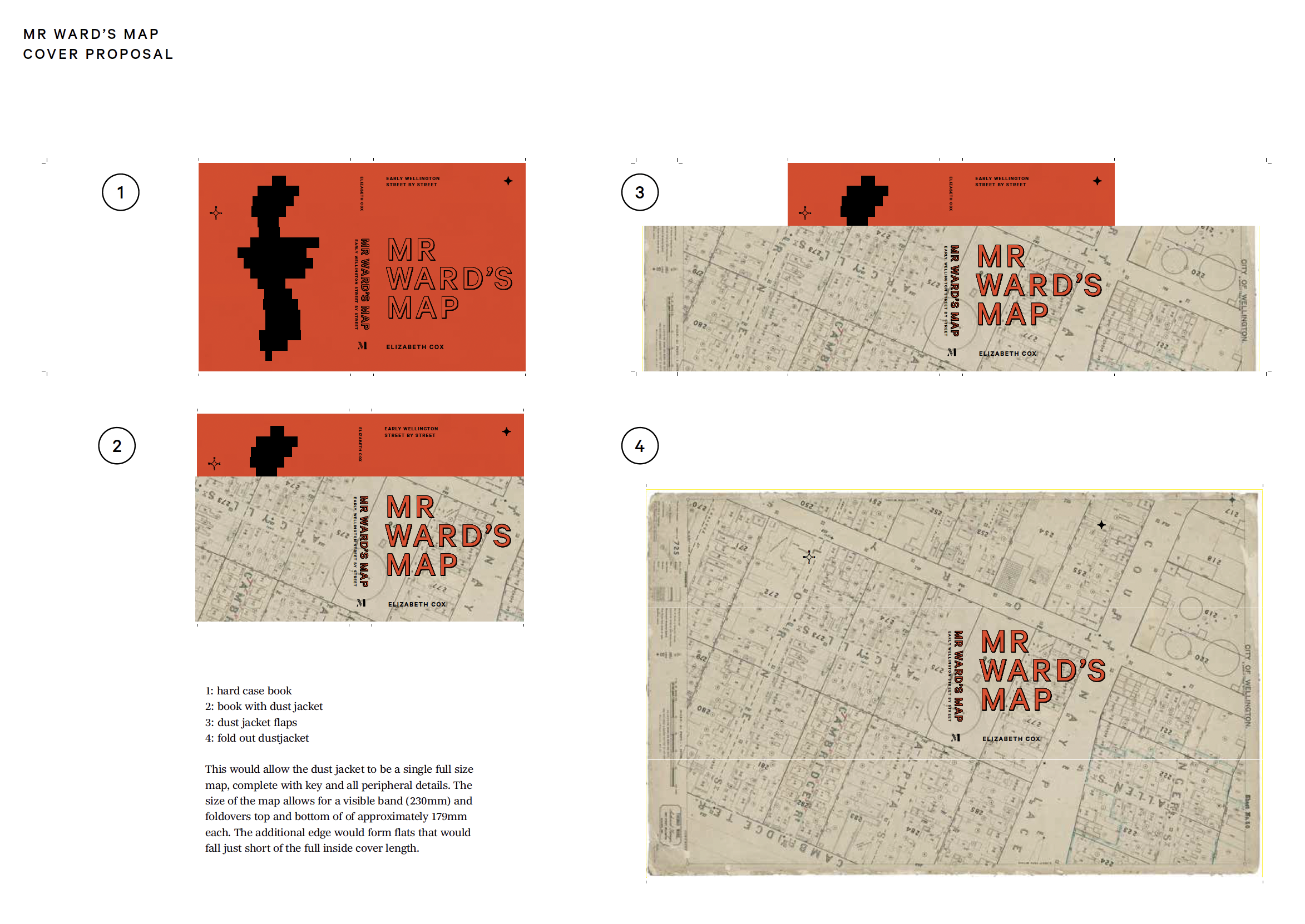
Part of a proposal I made documenting how the dust jacket could work
A test of the paper prototype
For my part, one of the biggest tasks was working on a system to guide the reader through this content. This includes annotated maps linking to images, which I insisted were as ‘heads up’ as possible—oriented so the map and the corresponding image were pointing the same way. The annotation lines on the images link the specific corner or feature on the photograph with that point on the map to help a non-surveyor get their bearings. There’s also a graphic key on each section page that shows where the map sheets are located in the overall whole. The (albeit fairly cursory) testing on other people suggested that it did help them understand the content, though architectural drawing or planning purists will probably balk.
Studying the language of the maps was absorbing. The eclectic typography and hand-lettering is delightful. Initially, I wanted to find typefaces authentic to the time period of the map. The map text is largely hand-lettered and I did try to track down a corresponding design guide, to no avail. I tried to devise a font using scanned characters from the road lettering on the maps, but it felt a bit inauthentic (see images in the sidebar). Knowing I didn’t want to slavishly reconstruct the style, I took the elements I enjoyed most (the tracked caps with drop shadow, and the overall eclecticism of a system containing multiple styles) and took cues from that for the headings, using Klim’s Calibre (with adjustment in Illustrator to add a corresponding shadow) for the main titles, supported by Founders Grotesk Extra Condensed. The body copy is Carter & Cone’s Richmond Text, which was really nice to work with, and comfortable to read. Calibre comes in again for footnotes and other supporting text.
Storeys and stories
The section breaks use a triangle, inspired by the symbol from the map key that marks the number of storeys in a dwelling. In our usage, it is inspired by the almost extinct typographic asterism (⁂)—three asterisks placed in a triangle, used as a dinkus—a typographical device to divide text, now more commonly three asterisks in a row. I liked the nod to archaic typesetting conventions, giving new life to a symbol from the map—especially as it is used to mark new ‘levels’ in the stories (just as the map does with storeys!).
The arrows are inspired by the map’s compass icon, which (a bit of research and testing showed) is an asterism shape made from intersecting circles. Here, it is used to point to the direction of the image corresponding to a caption rather than as a magnetic compass, but the intent is the same—to show direction.
An InDesign file showing the footnotes, and also the triangle asterism, and image arrows inspired by map mark up icons
A screengrap showing the triangle dinkus, footnotes, and a recreated compass graphic
The accent colour came from some of the red pen mark-ups on the map—fortuitously, it also appeared as an accent in several images. It also looks great with the distressed paper of the maps. The inner endpapers are (I hope—as of today I haven’t seen the finished article yet) a teal in Pantone 2220U, which matches a colour I’d chosen for the sea in the map I made for the introduction, as a ‘key’ to situate the sheets. But the teal is also really close to some coloured-pencil marks that are on the dust-jacket map—a coincidence embraced for post-rationalised justification!
The page grid is 12 columns with 12 rows. Footnotes are set from the bottom, to keep placement consistent and as out-of-the-way as possible. They were originally going to be endnotes (which was Elizabeth’s preference) but they were too long and it was going to blow out the page count, so Nicola made the call. Personally, I also find footnotes more functional on the page where the number appears, as I actually do read the footnotes—and if there’s ever a book for footnote-reading geeks, it’s this one. Also, a pop of red text on a page is very pleasing. So, apart from rag-management hell, I love the footnotes. They span three columns on the inside—a space that also holds some captions (which, regardless of placement, are always a three-column span too).
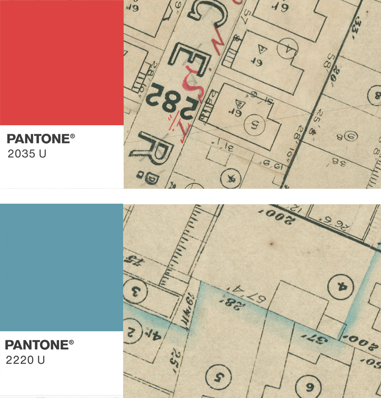
pantone swatches in 2035U and 2220U and corresponding map mark ups showing where the colour palette was derived
A page layout showing the grid
In real life, the knockout thing about the maps is the intricacy, but also the scale. The dust jacket was an opportunity to reproduce a single map at exact size, to give a reader a sense of the experience of viewing them. The endpapers reproduce this scale, also showing how the sheets fit together (with sheet 50 from the dust jacket joining parts of sheets 35 and 61 on the endpapers). I’m pretty nervous about the endpaper alignment, but all being well, it will work out—Everbest sent an image of the dummy and it lines up better than I hoped, so fingers crossed. This is also the first cloth-bound book I’ve ever designed, if you can believe it. I am very grateful that Nicola stretched the budget (and to the sponsors who made the extra bells and whistles possible). Bright red Sakura cloth with a black screenprint mirroring the typography from the dust jacket, with the subhead peeping over the top fold of the dust jacket, which folds to one of the internal text flowlines. The rear has the outline of the 88 sheets—a motif recreated on each map title page.
Less delightful were the multiple rounds of mark-ups and corrections, which took days. Anna, Nicola and team have exacting attention to detail, flagging not only typos and content corrections, but spotting even the most minor misalignment or incorrect space. I have huge respect for the publishing process and their skill (and patience). The idea that AI is going to replace that level of nuanced expertise any time soon is laughable—but it’s also sad—and worrying—that some people don’t see the value in that level of craft.
So, I await the book’s arrival in a few weeks with anticipation. The design is, in a lot of ways, not the most ‘designy’ or trendy—it’s functional, a little eclectic, and a workhorse layout for a huge amount of content—but I hope its appropriateness shines through.
It's here!
Whooo! On 5 November 2025 I took delivery of my very own copy. Apart from aching arm lugging the several kilos of paper home (it's really substantial!) I love it. Here's a quick and dirty reveal video!
One of the mock-up iterations of the book
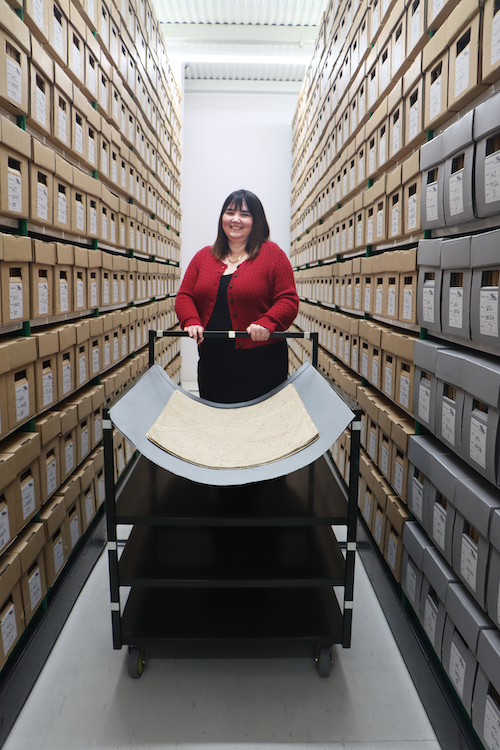
Elizabeth with a stack of map sheets in the archives © Tristam Sparks
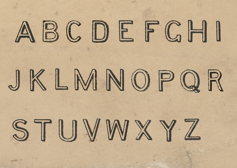
An alphabet made from scans of the map sheets

Testing a font made from the map text—an idea I ulitmately discarded as too inauthentic