#JoDoesPhD Part Six: Reflexive Abstracting: a new hybrid process?
It’s been a busy month or two.
I went to PCST (where I gave a short talk on my research plan based off an abstract we (by which I mean Rhian!) wrote before I started at Science in Society at the end of last year, and we ran a science communication retreat the following week. I won’t go on about those too much other than to say I met some fantastic people, heard some great things, was flummoxed by some other things, and ate far too much.
At PCST I re-met the fantastic Ceridwyn Roberts from Moto (aka Frangipani Squizimop). Ceridwyn gave a paper at SCANZ on visual abstracts (VAs). Motu are big on haiku abstracts, and she’d been looking into VAs as an additional communication tool. Her talk had piqued my interest as a designer, though I wasn’t sure how I was going to smuggle visual abstracts into my PhD project with its focus on reflexivity. The following week Chris Knox, a data journalist with the Herald came along to the science communication research retreat. Chris uses data visualisation not just to augment stories but also to uncover them. This made me itch a bit to get back into doing visual stuff for science communication.
Other than these injections of inspiration, I’d been a bit despondent. I had a meeting with Rhian and Rebecca in the diary but didn’t feel like I had much to show. As is always the case though, a chance to chat threw up new ideas. The interviews I’ve done with fantastic scien(ce/tist) communicators have been great, but interestingly I’d gravitated to people with a high profile and/or stellar science communication track record, but who perhaps are not communicating about their research specialism (and are instead acting as general science commentators or promoting a broad engagement with an area, such as maths or engineering). There’s clearly a place for broader commentary on science and for trying to engage people with disciplines, but I wondered about people who are engaging with disseminating their specialist research area wider than their own community.
In the back-and-forth of conversation, I mentioned visual abstracts. I’d had a twitter chat with Andrew M. Ibrahim MD, who’s been a vocal proponent of the visual abstract. He confirmed that it has mostly been medical researchers and a few medical journals who have picked it up, plus PhD students from a range of disciplines (this is what I thought from my cursory scan, with Dr Ibrahim’s name coming up over and over). I postulated that the process of creating a visual abstract with a scientist would be an interesting way to frame an interview. And so reflexive abstracting was born (actually it was born just then as I typed it haha!).
So the idea is this: with a scientist who has a pending publication, or presentation, or opportunity to engage with specific groups (I can’t yet bring myself to say ‘publics’ – it’s just so impersonal!) I’ll use the development of a visual abstract as an opportunity and tool. Why would they want one? As Cox (2015) puts it, a VA might create:
…an opportunity for authors to get more people to read their research. The innovative scientist who uses this knowledge and optimizes a graphical abstract to attract the right attention will benefit. Her work will be seen by more people, possibly leading to more interest in her research. This may lead to unexpected collaborations and more funding, citations, and recognition.
Cox (2015)
It seems a decent quid pro quo – I get an interview, the scientist gets a communication tool (and I get to push pixels!). I think it could be a really useful way of both distilling research down to an essence (‘everything as simple as if can be, but not simpler’, though attributing that to Einstein isn’t actually that simple…), and talking about the process of research, audiences, appropriate engagement and the like – a reflexive process in its own right.
So, as I need to assemble my PhD proposal soon (I’m putting it out there so I can be held to account! Draft by the end of the month!), here’s a mini review on what’s out there on visual abstracts.
What and whom?
There are a couple of terms that are largely synonymous in this area: visual abstracts (VA), and graphic or graphical abstracts (GA). Dr Ibrahim maintains a useful primer on his website, in which he describes a visual abstract as:
a visual summary of the information usually found within the abstract portion of an article. Similar to the actual text abstract of a research article, it is meant to convey the key findings of the article in a shorter format.
Dr Ibrahims was instrumental in developing the first visual abstract specifically tailored for social media dissemination (published in the Annals of Surgery in July 2016). These follow a set format: ‘a triptych layout, single color icons, and direct reporting of primary outcomes’ (Ibrahims, 2018). The uniform look and feel also help establish a convention for the reader as well as a consistent brand element.
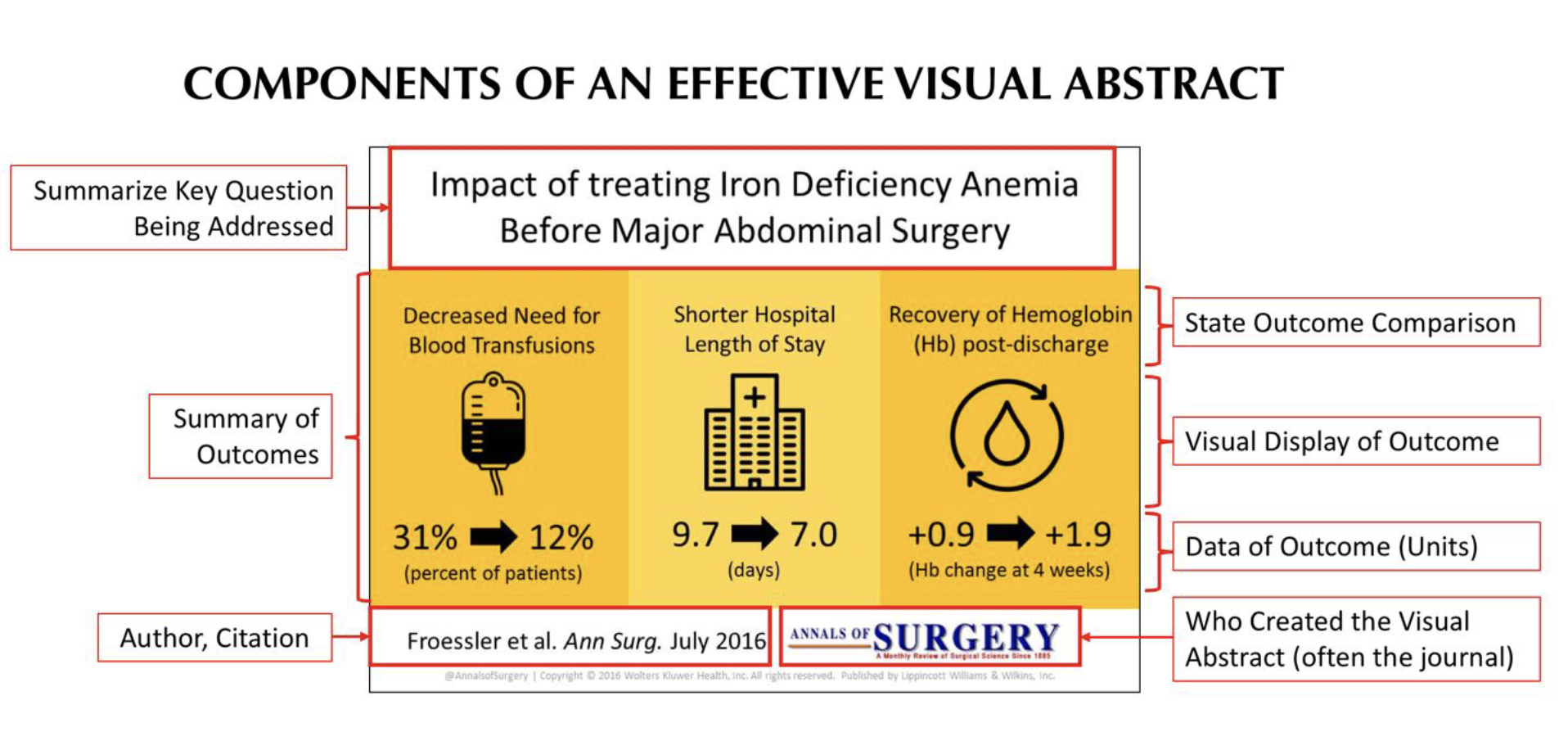
Components of a visual abstract, from Ibrahim (2018)
Elsevier have guidelines for producing graphical abstracts, which they describe as:
A single, concise, pictorial and visual summary of the main findings of the article. This could either be the concluding figure from the article or a figure that is specially designed for the purpose, which captures the content of the article for readers at a single glance.
(Elsevier, n.d.)
The examples they provide seem to act simply as diagrams rather than a stand-alone summary that could, for instance, be shared on social media to give a general sense of the paper’s content. This is an exemplar from their library:
Example 1: Antinociceptive effect of the essential oil of Zingiber zerumbet in mice: Possible mechanisms, Mohamed Hanief Khalida, Muhammad Nadeem Akhtarc, et al.,
Journal of Ethnopharmacology, Vol. 137, Issue 1, 1 September 2011, Pages 345-351.
As you can see, very technical, and not necessarily a good social media friendly summary.
The NRM (Natural Resource Management) Science Conference 2018 specifically asked for visual abstracts, which they call ‘a great tool to deliver short, sharp science’ (but don’t define further than that). Their examples tend towards an infographic or comic book style (they are mostly designed by the same commercial outfit, Animate your Science). They do offer a much more holistic overview of the paper’s research question, findings and broad conclusions:

Example visual abstract by Animate your Science
In addition, there are examples out there that use the name ‘visual abstract’ but are in fact a more comprehensive slideshow or video-precis of an article, such as the supplementary material in this Annual Review of Marine Science article.
Who else?
Currently, Annals of Surgery, Journal of the American College of Surgeons, The New England Journal of Medicine, JAMA Oncology and Canadian Journal of Anaesthesia are all displaying visual abstracts on their social media feeds (see #visualabstract on Twitter). Dr Ibrahim keeps a list, which currently stands at over 60 journals. Most of these are within the medical field.
History
An article in Nature Chemistry (“The art of abstracts,” 2011) traces the visual abstract back to the 1970s (the German language Angewandte Chemie), with regular appearances since in the Chemistry literature, all predating the social media age. Elsevier’s journal Cell has their own guidelines, and back in 2009 Elsevier and Cell Press were running a (now defunct) Article of the Future project to take ‘full advantage of online capabilities, allowing readers individualized entry points and routes through content, while exploiting the latest advances in visualization techniques’ (“News Releases » Elsevier announces the ‘Article of the Future,’” n.d.). Graphical abstracts were a central plank of this project. Ibrahims (2018) draws attention to the very similar ‘Central Illustration’ which Elsevier’s Journal of the American College of Cardiology guidelines describe as an image which:
…summarizes the entire manuscript or at least a major section of the manuscript. … The purpose of these illustrations is to provide a snapshot of your paper in a single visual, conceptual manner.
Evidence
There is surprisingly little in published research databases about the efficacy of visual abstracts. In fact, on about page 2 of a keyword search I was already getting junk results about Miley Cyrus videos!

Hmm I don’t think We Can’t Stop Music had a strong scicomm theme?
In addition, there isn’t necessarily a uniform objective across people utilising them. In terms of literature on their performance, there are two recent published articles: Does a Graphical Abstract Bring More Visibility to Your Paper? by Pferschy-Wenzig, Pferschy, Wang, Mocan, & Atanasov (2016) in Molecules, and Visual Abstracts to Disseminate Research on Social Media by Ibrahim, Lillemoe, Klingensmith, & Dimick (2017) in the Annals of Surgery, both looking at aspects of increased reach when visual abstracts were used. Ibrahim et al conducted a case-control crossover study to compare tweets that included only the title of an article versus tweets that contain the title and a visual abstract. They found a strong correlation between the use of VA tweets and increased dissemination on social media: when the same articles were tweeted as a visual abstract there was a 7.7-fold increase in impressions and an 8.4-fold increase in retweets and a 2.7-fold increase in article visits (Ibrahim, Lillemoe, Klingensmith, & Dimick, 2017). Pferschy-Wenzig, Pferschy, Wang, Mocan, & Atanasov (2016) compared publications with and without GAs published in Molecules between March 2014 and March 2015, and found that (contrary to their expectations) ‘among all manuscripts, those without GA performed better in terms of PDF downloads, abstract views and total citations’ (p.3). They suggest that this may be due, in part, to the fact that younger, less established scientists may be the ones most likely to try this visual format, and well-established scientists who are more well-known experts in their field will generally get more citations, views and downloads. They also posit that ‘this finding could be the direct effect of a well-designed GA which gives the observer a concise idea of the content of the paper and thus makes an explicit abstract view or paper download superfluous. This point of view would suggest that papers with GA might receive fewer but better targeted downloads.’ (p.3). They conclude with a call for further studies in this area.
VA design
I could find only one published article that considered the design of visual abstract centrally: ‘Benefits of using design science as a research paradigm in software engineering’ (M. A. Storey, E. Engstrom, M. Höst, P. Runeson, & E. Bjarnason, 2017). This paper advocates using Technological Rules ‘which are rules that capture general knowledge about the mappings between problems and proposed solutions’ (p.182) as a central part of a visual abstract. This can be expressed in the form: to achieve <Effect > in <Situation > apply <Intervention>. This paper seemed very specific to applying design science to software engineering and contained no evaluation. TBH it went over my head. I could dive into literature on semiotics or other analyses of the efficacy of certain visual strategies. I had high hopes for a paper that sought to ‘study the underlying semiotic mechanisms through which visual thinking makes complex scientific content accessible’ (Fernández-Fontecha, O’halloran, Tan, & Wignell, 2018), but ultimately, trying to analyse literature on the design of visual abstracts, or of styles and strategies, or the ‘intertwined relation between visual perception and cognition’ Fernández-Fontecha et al, 2018) is really outside my scope (as I’m using the VA as a vehicle for another purpose). But I’ll be getting the Edward Tufte books back out of the library anyway!
In terms of the usefulness of VA’s beyond their potential impact or reach, there are a couple of design downsides. Notably that a simple jpg or png cannot contain clickable links, so unless the accompanying text (in a tweet or elsewhere) links to the specific article, the ability to ‘drill down’ from this abstract to published research can be impaired. Many abstracts do contain text (there’s little way around this) and there is a risk that if VAs become more widely used, and if people don’t scaffold these with either well-written alternative text tags, or explanation in-text, people who rely on screen-reading software for accessibility will be disadvantaged. A great blog post by Anderson (2017) touches on this, highlighting that though a visual abstract, when done well with ‘plain language explanations of concepts’ might actually ‘be more accessible to folk with cognitive or learning disabilities’ it may well be ‘less accessible to those with visual disabilities’. She also highlights the limitations of searchability for images and goes on to highlight that a visual abstract and a written abstract complement, don’t replace each other: ‘offering both strongly empowers science communicators and educators, especially if the images are licensed to promote use and dissemination’. She suggests that making VAs Creative Commons licensed as a matter of course would be preferable, and indeed CC licensing seems an excellent way to embed principles of openness into the process.
So what next?
I’ve established that visual abstracts are gaining traction, but have largely been used in the medical field. It would be excellent to try these out with a range of disciplines, and the Te Pūnaha Matatini network is an ideal vehicle for this given the interdisciplinary nature of the organisation. A lot of Te Pūnaha Matatini scholars are active on social media, so there’s scope to test the abstracts there and perhaps consider how the VA format can feed in to new practices in professional communication and in communicating science a to different publics (ok I’m trying it out but it still feels ugh!). It would also be really nice to be able to offer a consistently formatted tool for Te Pūnaha Matatini to use as a communication vehicle at the organisational level.
I’m also nervous-excited to do some hands-on co-creation, and I’m going to have to consider what methodologies might need to inform this move from semi-structured interviews to something a little more fluid. A couple of blogs ago I wrote:
wtf is action research really? I should add to that phenomenology, grounded theory, thematic analysis… a whole list of things that make me feel out of my depth. Some work to do here, and people to talk to.
Yep, that still loom large. Next step, I need to work on working out how what I think I’m doing fits within established research methods, and fast!
References
Cox, L. (2015, June 5). Are graphical abstracts changing the way we publish? Retrieved May 14, 2018, fromhttps://hub.wiley.com/community/exchanges/discover/blog/2015/06/04/are-graphical-abstracts-changing-the-way-we-publish
Elsevier. (n.d.). Graphical abstracts [Academic publisher]. Retrieved May 14, 2018, fromhttps://www.elsevier.com/authors/journal-authors/graphical-abstract
Fernández-Fontecha, A., O’halloran, K. L., Tan, S., & Wignell, P. (2018). A multimodal approach to visual thinking: the scientific sketchnote: Visual Communication.https://doi.org/10.1177/1470357218759808
Ibrahim, A. M. (2018). Seeing is Believing: Using Visual Abstracts to Disseminate Scientific Research. The American Journal of Gastroenterology, 113(4), 459–461. https://doi.org/10.1038/ajg.2017.268
Ibrahim, A. M., & Bradley, S. M. (2017). Adoption of Visual Abstracts at Circulation CQO: Why and How We’re Doing It. Circulation: Cardiovascular Quality and Outcomes, 10(3), e003684. https://doi.org/10.1161/CIRCOUTCOMES.117.003684
Ibrahim, A. M. M., Lillemoe, K. D., Klingensmith, M. E., & Dimick, J. B. M. (2017). Visual Abstracts to Disseminate Research on Social Media: A Prospective, Case-control Crossover Study. Annals of Surgery, 266(6).
Ibrahim, A. M. (2018, January). Use of a Visual Abstract to Disseminate Scientific Research (version 4). Self-published. Retrieved from https://www.surgeryredesign.com/
News Releases » Elsevier announces the ‘Article of the Future.’ (n.d.). Retrieved May 14, 2018, fromhttp://www.kaizo.net/releases/article-of-the-future/
Pferschy-Wenzig, E.-M., Pferschy, U., Wang, D., Mocan, A., & Atanasov, A. G. (2016). Does a Graphical Abstract Bring More Visibility to Your Paper? Molecules, 21(9), 1247. https://doi.org/10.3390/molecules21091247
Rodríguez Estrada, F. C., & Davis, L. S. (2015). Improving Visual Communication of Science Through the Incorporation of Graphic Design Theories and Practices Into Science Communication. Science Communication, 37(1), 140–148. https://doi.org/10.1177/1075547014562914
Storey, M. ., Engstrom, E., Höst, M., Runeson, P., & Bjarnason, E. (2017). Using a Visual Abstract as a Lens for Communicating and Promoting Design Science Research in Software Engineering. In 2017 ACM/IEEE International Symposium on Empirical Software Engineering and Measurement (ESEM) (pp. 181–186). https://doi.org/10.1109/ESEM.2017.28
The art of abstracts. (2011). Nature Chemistry, 3(8), 571. https://doi.org/10.1038/nchem.1109
Wray, C. M., & Arora, V. M. (2017). #VisualAbstract: A Revolution in Communicating Science? Annals of Surgery, 266(6), e49. https://doi.org/10.1097/SLA.0000000000002339
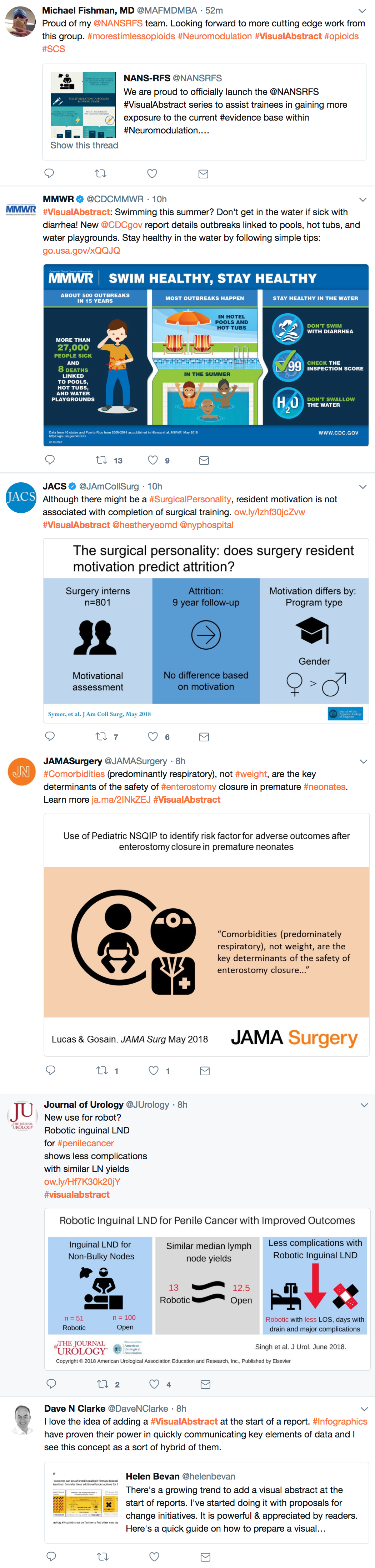
Visual abstracts are increasingly shared on twitter under #visualabstract