Work in progress July 2018
There are a couple of publications in the pipeline that I've been working on, and they've been polar opposite in terms of process.
I'm proud of them both, but one was a labour of love, and the other just a breath of fresh air in terms of going smoothly!
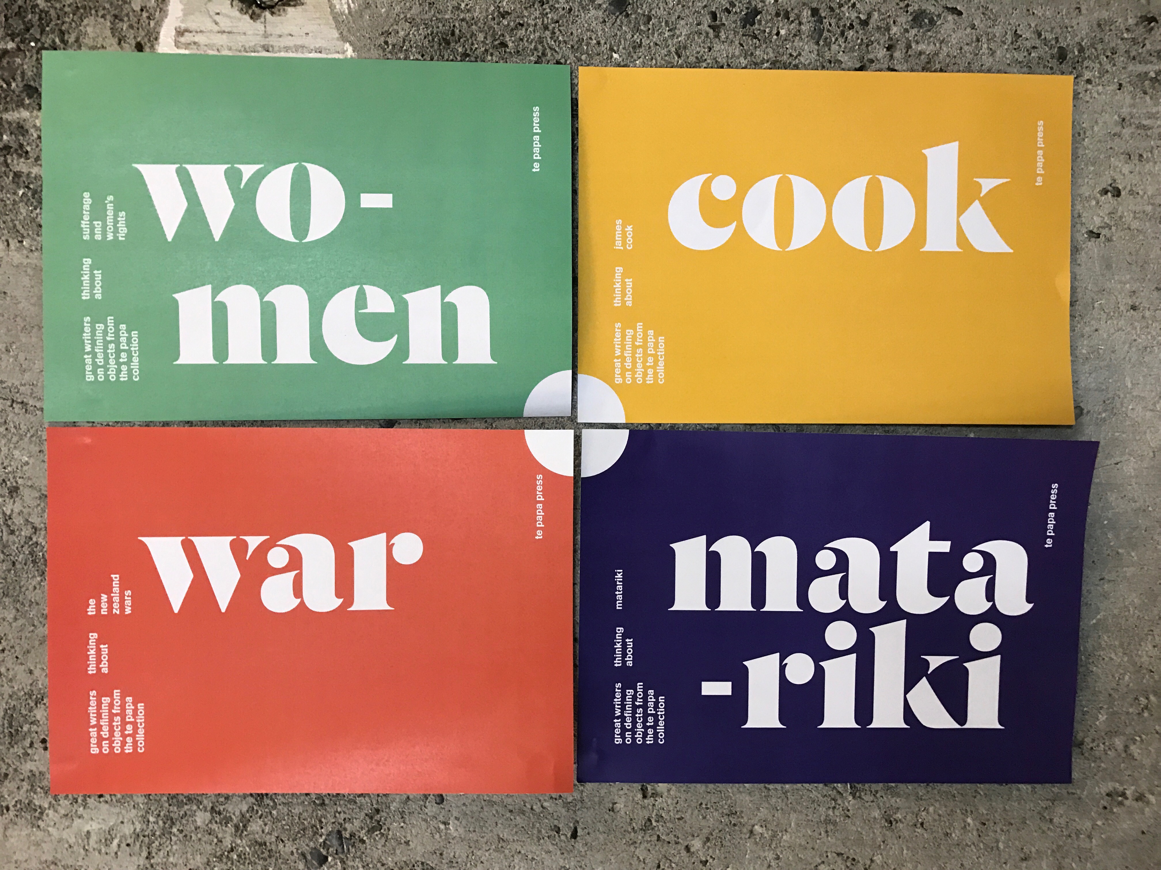
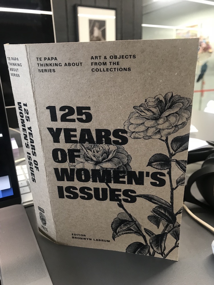
The first is a book for Te Papa Press. Its no exaggeration to say, it went through six versions, all developed to a reasonable level of resolution and at least as many working titles before it came to fruition, and it's at the press right now.
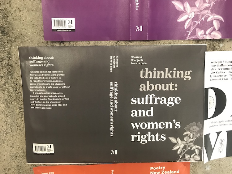
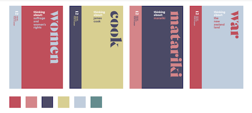
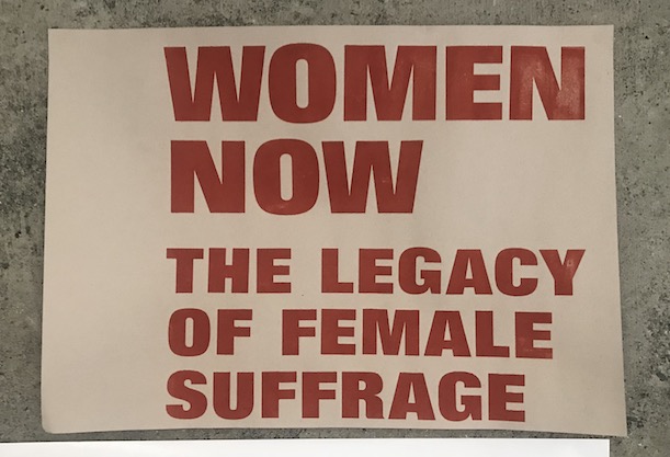
The brief was for a series system for essays based on Te Papa artefacts, the first of which was women's suffrage.
The first version we settled on was a delicate typographic one, which I really loved. Another was harder-edged, based on a single colour on rough board stock, which I also liked (and pushed back against the 'printed manilla' idea – I'm not that into fake texture). It turned out the editor wasn't keen…
One of the early typographic versions
The type and illustration version I was keen on…
I then produced a whole sheet of fresh concepts, one of which was a block-print style. I should know by now. If you don't really want to do it, don't make it an option!
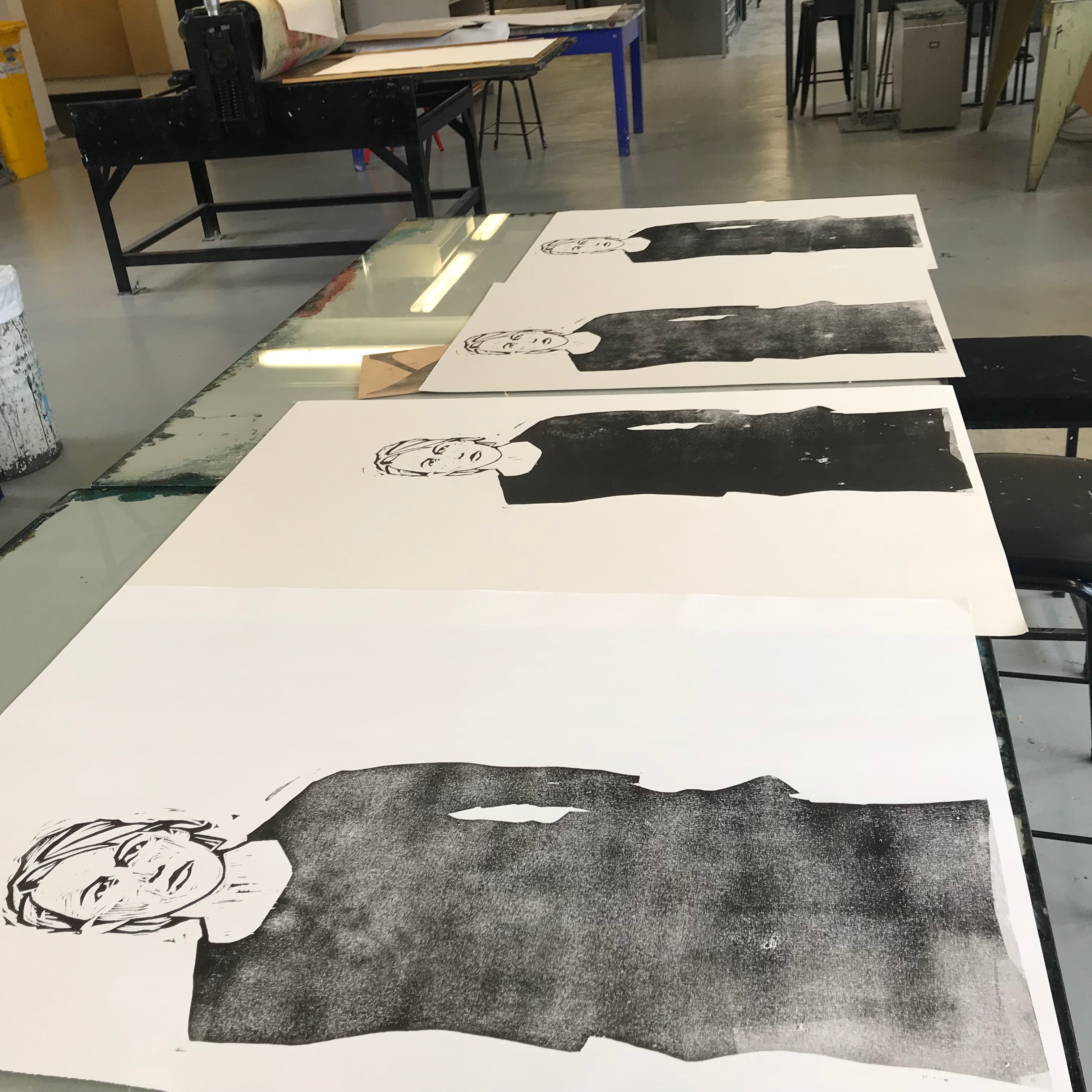
This then turned into a painful process whereby I (not an illustrator) tried nasty faux-print in Photoshop. We engaged a couple of great illustrators, but their styles just didn't really work. Then, I walked into our type studio to chat to John who runs it, and saw something…
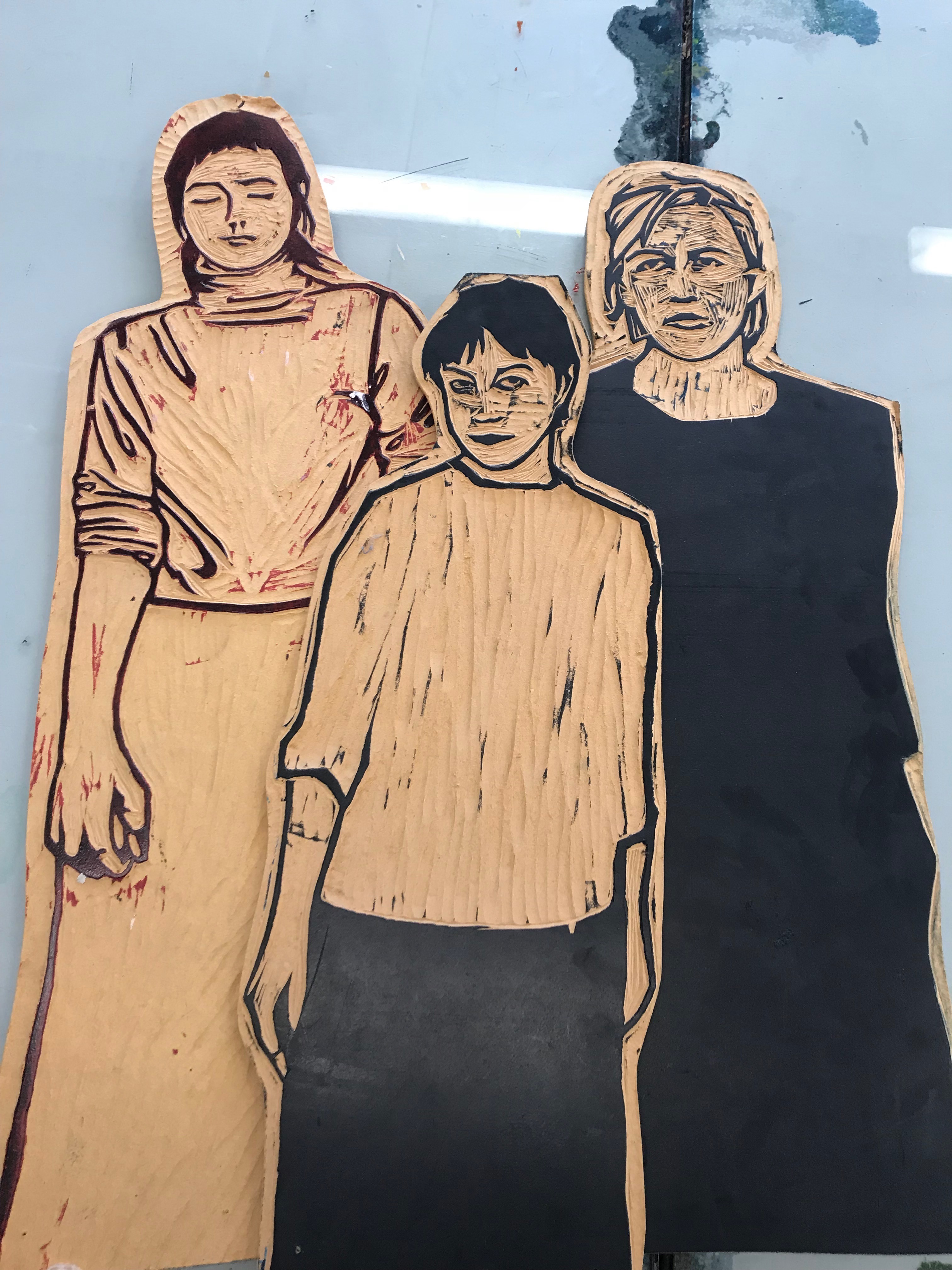
A bunch of lovely woodcuts! So I tracked down the owner – Stefan Messam graduated a decade ago, but I found him on Instagram. He was really happy to be reacquainted with his three friends (the portraits were of peers at design school), and was more than happy for me to reuse his blocks. What a delight!
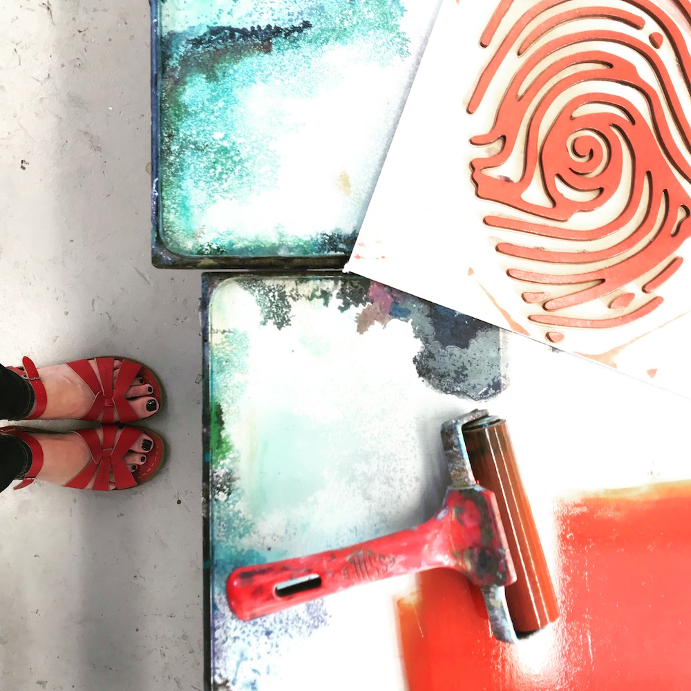
So I got messy and printed from these old blocks. Luckily, they went down a treat. I also lasercut the book's type and the Te Papa logo and rolled those too, so everything had a genuine print quality.

Playing with image and type
With some cosmetic tweaking (people were split on if she looked steely determined or tired and beleaguered), we got there! I'm really looking forward to seeing the final artefact, which morphed into a hard-cover (the first I've ever done). Though I scanned the print and paper for texture (so it's authentic-one-removed), I'm happy with that – not quite so much of a cheat as Photoshop fakery.
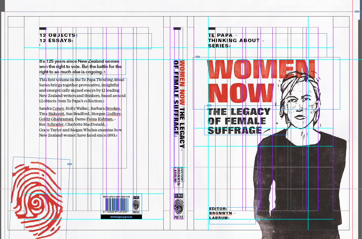
The working file of the nearly there book!
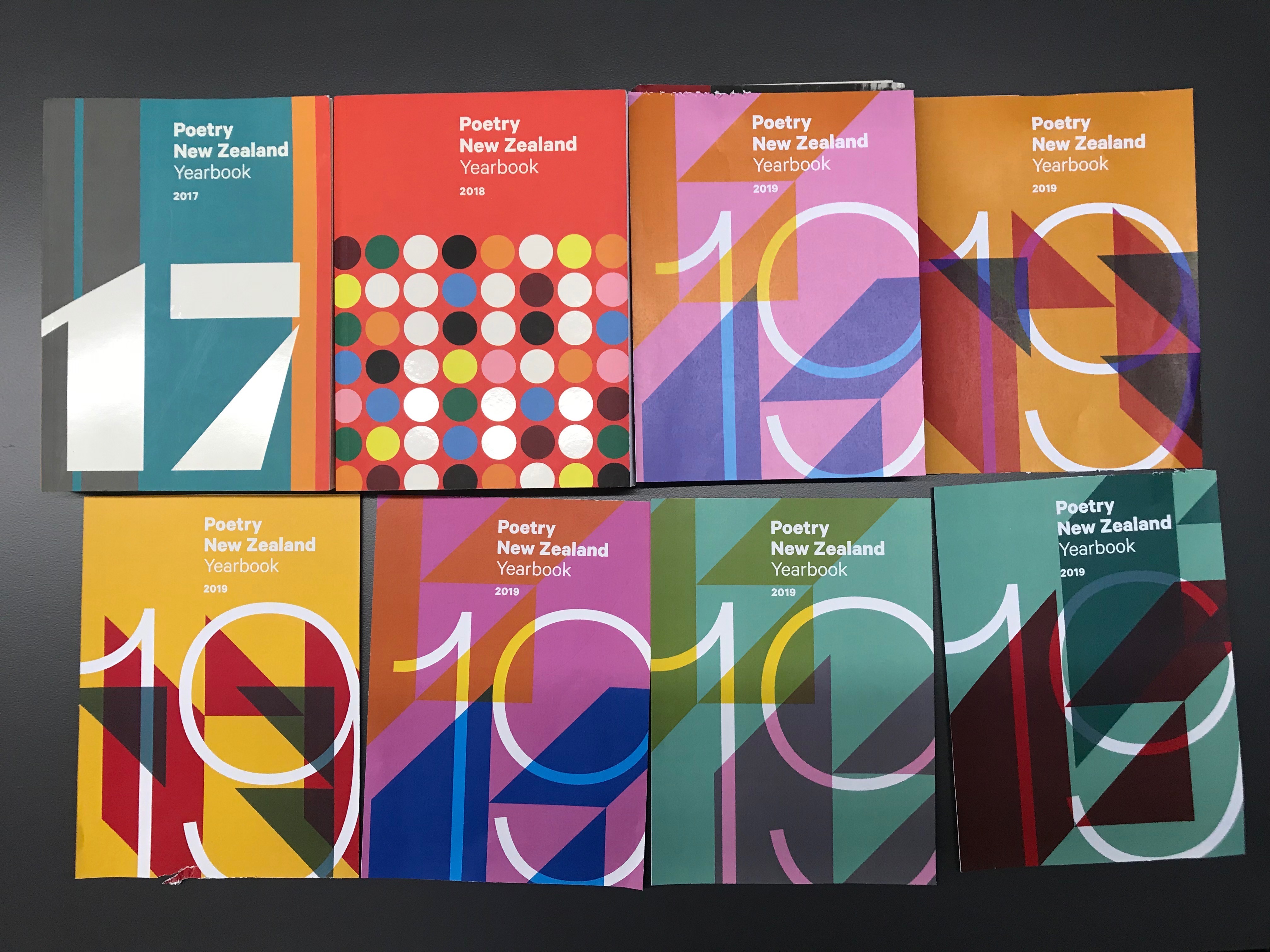
The other project was a concept for Poetry 19. I had worked on this the previous two years with Thomas Le Bas, and luckily there was one that had been in the mix for 18 that we didn't use. So, a quick rejig, and voila! Our next version will expand the vibrant system from the previous years! A mock up to a yey! from the editor and publisher in a handful of hours. Well pleased. This one will be worked up to print later in the year.
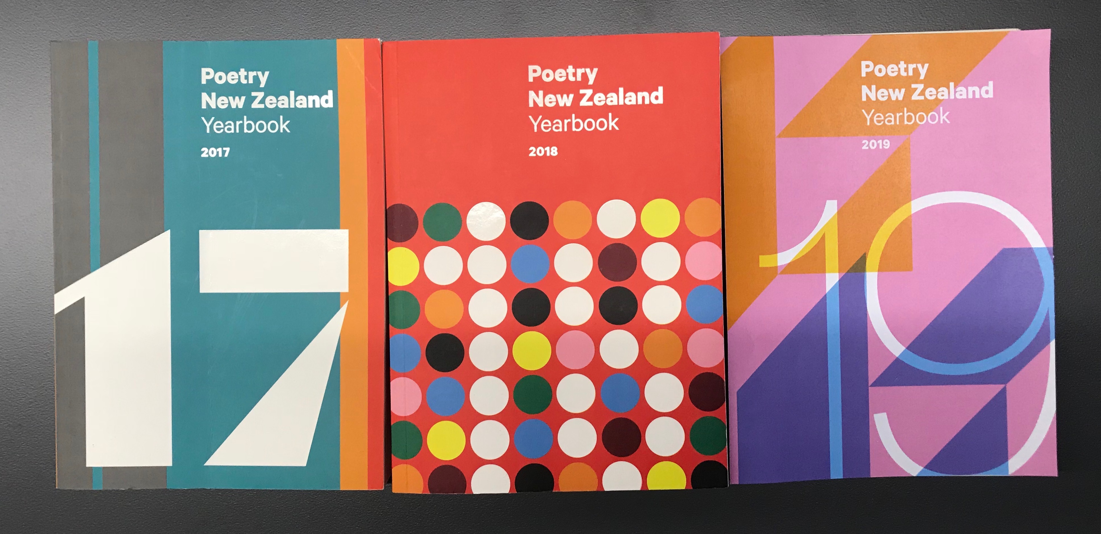
A trio of poetry good enough to eat
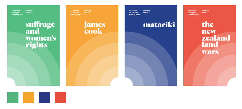
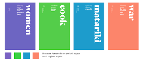
Three of the many versions of the system.
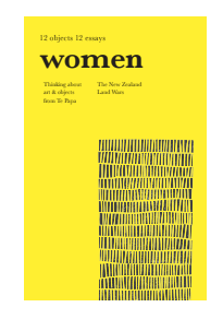
A board version
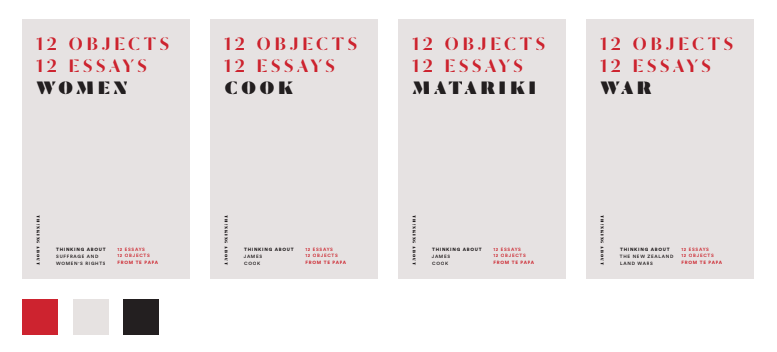
Some more type options
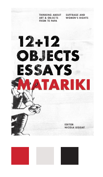
The block print mock up
Another version…
Test prints on different stock
Hand printed type
Colour coordinated logo printing!
Tests for Poetry 19